25.7.12

Balenciaga Etc

These images aren't really all that connected, except that they make me think of each other for some reason, maybe it's just the mood and vibes. A common complaint is that fashion magazines have copious ads, but I have to say that I love me a good campaign and I enjoy flicking through advertising as long as the images are interesting. These Balenciaga and Pringle of Scotland campaigns do it for me. RIP Alistair Carr at Pringle - you could have done great things.


While we're at it I am going to have to throw in last season's Balenciaga campaign too, because it is one of my favourite ever. I didn't like the collection all that much until I saw these pictures, and then it all made sense. It's so satisfying when a campaign can pull everything together, clarify everything in a way that runway can't do on its own.


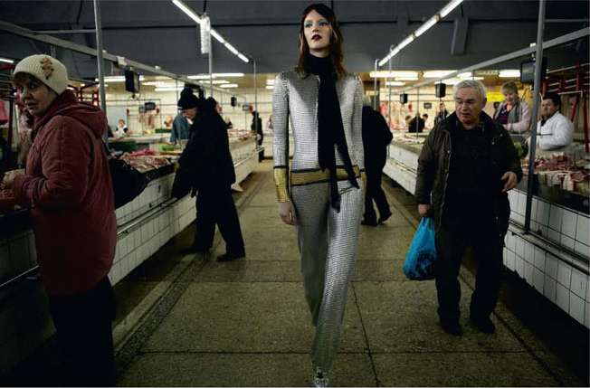
I'm also including here, only because it seems related for reasons I can't quite say, a recent Dazed and Confused editorial. I guess this is a pretty lazy post - I'm just gonna post some images that I like cuz I can! - but I swear there is something going on here! Future dressing! New aesthetics! Something!


Balenciaga images from balenciaga.com
Dazed and Confused images from Fashion Gone Rogue

13.7.12

Paris Couture A/W'12 - Dior

So much has already been written about this show that it's hardly worth me writing about it too, but since I was so excited when Raf Simon's appointment was announced I figure I may as well jump in to the fray. Although I'm not sure if one can call it a fray since the responses have been almost entirely positive. In fact the only negative thing written about it - "One Critic Dares to Knock Raf Simon's Dior Debut" announced The Cut - wasn't really about the collection at all but about the set. Colin McDowell at The Business of Fashion wrote it was ostentatious, but really I think he was just clever and was rustling himself up some press for being the one critic to dare knock Raf Simon's Dior debut. So was the set, a million flowers lining the walls, ostentatious? Maybe, but it was also beautiful and oh lord I wish I'd been there to see it. Instead I'll have to make do with pictures and a video showing its creation.


What about the collection itself? Well, it's hard to write on actually. Everyone was expecting great things, amazing things, something revolutionary, which was very silly because of course we didn't get it. And so while we built ourselves up for disappointment, it wouldn't be fair to say that it was entirely disappointing either. The clothes were undoubtedly beautiful and nothing less than what we've come to expect from Simons, but while critics were talking about how the collection marked a shift for couture I felt this was the promise of a shift. Simon's hasn't quite arrived in this particular collection but I'm sure he will soon - and he said himself that the collection was "a blueprint", a statement I've taken to interpret as not quite the final product. 
I must admit there was an air that the collection had been rushed a bit, which would make sense considering Simon's had only a short time to acquaint himself with and utilize his new atelier. I always like my collections to fit together perfectly, to make one cohesive statement, and I thought the show was lacking somewhat. Dyed fur and Sterling Ruby prints in a single show seemed almost too much. And the inclusion of those dyed furs irked me, possibly due to their resemblance to Marc Jacobs' Jamiroquai hatsOn a more positive note, he has married Dior's history and aesthetic with his more minimal one perfectly, although we all knew he could do that already


If this sounds unfair to Simons - judged in black and white the collection is most definitely a success - it is only that so much is expected of him now, after four incredible final collections for Jil Sander. And I'm almost certain that he'll live up to the expectations, which is all rather exciting!


runway images from vogue.com

6.7.12

Super Fun/Hilarious: Couture F/W'12

Unexpectedly so far couture has been super fun, although I am not entirely sure how intentional the effects were. First of all, I think we all know where Karl got his inspiration for this season of...


...Microsoft Word! And also in my opinion, Meadham Kirchoff and riot grrrls! There was pink, pom poms and midriffs - all riot grrrl staples. And this is getting way meta because of course riot grrrl-friendly Meadham Kirchoff referenced Chanel a couple seasons back. Perhaps Karl's been looking at that as well as Petra's work over at Rookie Mag. Anyway, this interpretation is very kind, because without it the collection is just straight tacky. Karl's hella tacky, but I think it's going to take a while for everyone to realise it. Perhaps they never will.


Alexis Mabille gave us even more metallic and the best hair ever. It is like the models are those scary angler fish, but beautiful! A part from that, I admire that Mabille managed to make the models look like they have hips. 


Grouped together they look like a scary fish gang! In contrast, who knew how adorable Alexis himself is?


images from vogue.com, style.com and one great fish from The Oatmeal

3.7.12

Edeline Lee Cool Cool Cool

Saw this collection on NY Times' T Magazine Style blog or whatever its called (I get so confused on that site), I thought it was awesome in a more wearable/down to earth Bouchra Jarrar kind of way, and I had no idea who Edeline Lee was so I looked her up. Now this collection is pretty cool, make no mistake, but the importance of presentation was highlighted for me because I liked these images a whole lot more than the ones on her website. I might not have given any of it a second thought if her website was where I'd seen it first.


T Magazine tells me that the collection is inspired by the Wiener Werkstätte, an early 20th Century design movement/collective. All very art deco and with an ordinary-as-art and beauty-is-practicality ethos. Lee's logo is riffed directly from the Wiener Werkstätte's, which is a little too literal for my liking, but I do like the subtle way that she's incorporated their design principles into the clothes. One lovely detail mentioned by T Magazine was the "beauty buoyed by craft: soft pleating of a cream-colored Grecian frock is anchored by an inner grosgrain belt that preserves its shape without interrupting its flow".


Special mention must go to the redhead. I don't know what that expression she has is, but it sure works for the clothes and the vibes. Also: Couture Winter 2012 is happening! Reviews coming shortly.


all images from NY Times