13.1.12

Art and Fashion #3

Photographer Alex Prager is a really hot topic on fashion blogs at the moment. I can totally understand the appeal - you've got pretty girls in pretty dresses and pretty make-up posing in California which is so trendy right now, and the vivid colours are incredible and yet the subjects, for all their beauty, seem dark and tormented. All irresistible to a 14-24yr old woman. But what I think makes Prager so interesting is that when she forays into fashion editorials and campaigns, she manages to blend 'art photography' and 'fashion photography' pretty seamlessly. The subject of whether fashion photography can be classified as 'art' is a tricky one, and so I won't go into an in-depth discussion on that (today at least), but I will look at it generally and how Alex Prager fits in.


If you look at other photographers who work both for fashion and for art's sake, they tend to divide their work into two distinct categories. Fashion photography, while being 'artistic' for sure, is commercial while art, on the other hand, is art. I guess this separation is kind of like protection for the photographer, so at least sometimes their work can be taken seriously. Juergen Teller is one fashion photographer who does art projects too. While I personally believe that most of his fashion images can be considered art, his 'art' images and his 'fashion' images are separated, and they have distinct subjects and moods. Occasionally the two categories become blurred, but when it does the photos are generally considered too abstract for a fashion magazine but not serious enough to be considered art.

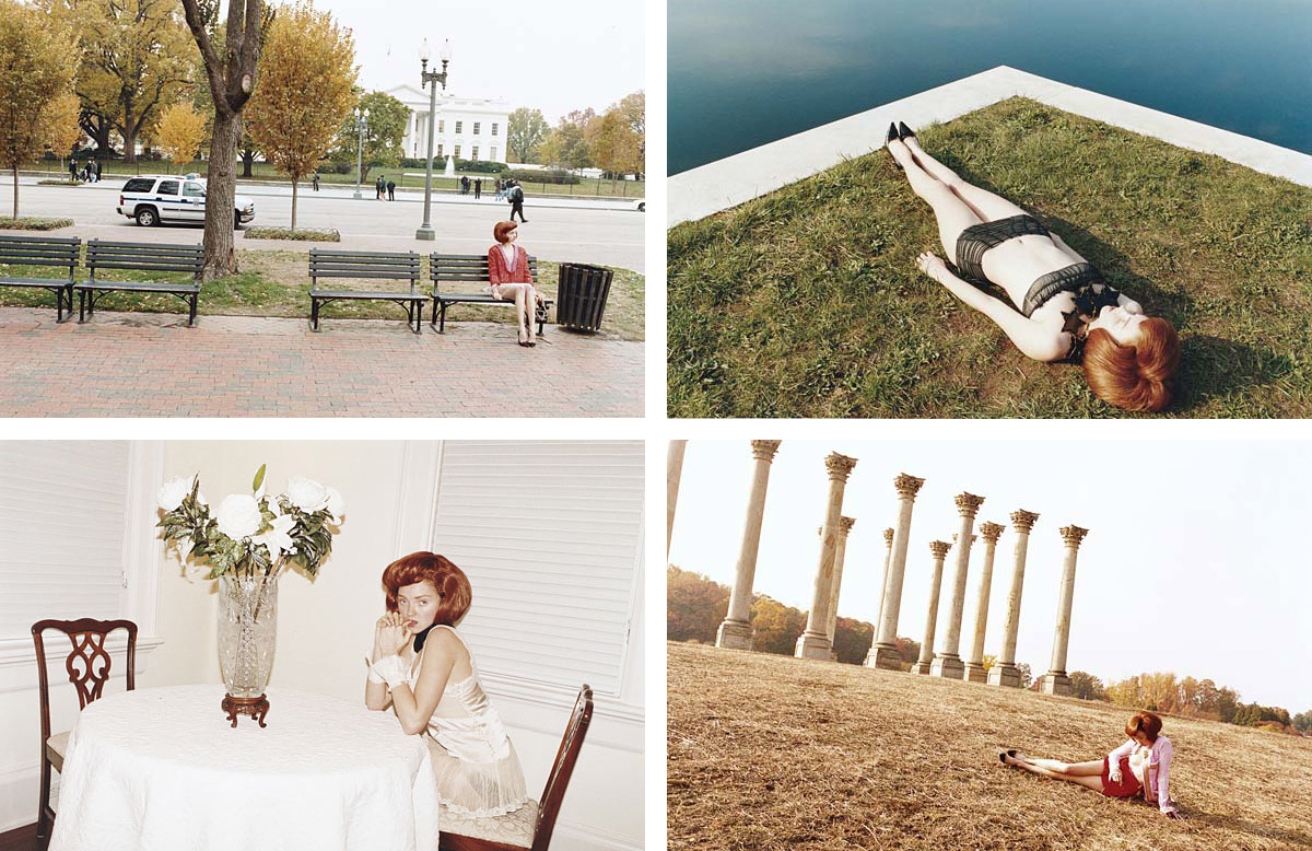
Art:

Not Art:


Prager is unusual because her editorial and campaign work is almost indistinguishable from her artistic endeavors - the only giveaway being the models' weight. I guess her subject matter lends itself to 'fashion' easily - the subjects are in costume rather than just wearing clothes, and they are always role-playing an identity, much like the identity and image transformation of a fashion editorial. And because there is a focus on dressing-up and role playing, there is of course a focus on clothes.


Thankfully Prager herself doesn't seem worried about dipping into the low-brow world of fashion and as a result we get fantastic work like this editorial and accompanying short film made for W Magazine. This was the first work of Prager's I'd seen and boy was I sold! I think I started buying W after this actually - they may have a worrying attachment to celebrities and over-hype everything, but their editorials are routinely extremely excellent.


Prager also seems to have been influenced a fair bit by Cindy Sherman. You've got young women role-playing and constructing identities, cinematic angles, intriguing narratives and an always pervading dark humour. And Prager's Film Stills from Despair with Bryce Dallas Howard, while actually film stills, are a nice nod to Shulman's famous Film Stills series.


And they are of course similar because Sherman, too, forays into fashion from time to time. In the last five years alone Sherman has made work for Balenciaga, and done campaigns for Marc Jacobs and M.A.C. (which is technically beauty, not fashion but whatever). But somewhat curiously, editors and curators always omit Sherman's fashion work from retrospectives about her. Which suggests that those in the art world regard Sherman's fashion photography as something other than 'art' even though, in terms of both subject and style, her fashion photos are very similar to her other work.
Because of this, when I read that MOMA had bought a bunch of Prager's photographs I assumed that that wouldn't include any fashion images - but I was wrong! I'm pretty sure that they bought some of the photographs she did for W. Which makes everything even more complicated and leaves me with no conclusion at all really. Just thoughts, lots and lots of thoughts about what is fashion photography and what is art.


Teller's editorial photographs and Prager's Sunday series from W Magazine

10.1.12

Craig McDean Celebrities

Celebrity portraits I usually associate with lameness and those newspaper Sunday magazines but Craig McDean manages to make the exceptions. I came across these when I was trying to find an editorial for my last post and I liked them all! The Kate Moss one makes me think of how early-to-mid-2000s is already becoming a retro trend, the Kirsten Dunst one makes me think about her time in rehab :(, the Scarlett Johansson one is just very intense and the Kristen Stewart one makes me laugh. In a good way! I hope it makes you laugh too.


Celebrity portraits are pretty strange things I guess. Way back in the day, especially in the 40s and 50s when Hollywood was really in its groove, these photos were simpler, happier, less full of subtext and meaning. My grandmother has a wall full of framed, signed photos of actors like Fred Astair and Greta Garbo and the like, and in every one they are smiling and glamorous and perfect - if they had torrid personal lives and everything was falling a part, who were we to know! We just liked to look at people being pretty. These days, actors channel the torment that those past actors were hiding or channel themselves or generally look mysterious and thoughtful or channel the mysterious and thoughtful lives that their characters lead and it's all very Vanity Fair. But even though it's a bit contrived, if it gets me some nice photos in the end, well I'm cool with that.

8.1.12

Fashion's Got a Good Thing Going With Chairs

The Proenza Schouler campaign came out today (or at least Fashion Gone Rogue posted it which is basically the same thing), and I noticed it has taken part in the latest growing fashion trend - chairs. Chairs, it seems, are the latest major accessory. Less practical than a purse, I am sure, but far handier at a table or say, in a waiting room.
I personally think this trend has something to do with the more general obsession people have at the moment with 'mid-century' (oh god this term mid century, sometime later this week I'll do a post about that), and nothing says mid-century more than a functional, yet gorgeous, chair.

With Proenza Schouler, the choice is obvious, their collection was based on some mid-century principles after all! Although the inspiration was the more trashy side of mid-century, but never mind.


b MAGAZINE (b magazine, anyone? anyone?) are definitely on trend with their chairs, with a vaguely uneasy, pool slider heavy interpretation.


But even earlier than these examples, Craig McDean made a most glorious tribute to chairs in a 2010 Vogue Italia editorial. I'm sure many would agree when I say that in this case the supporting cast almost eclipsed the leading ladies.


Boy do these chairs make for some pretty edgy images. I'm also picking up that these images are communicating that if a woman knows her chairs, she knows her design, and if she knows her design, then she is pretty sophisticated.

While I've got the chance I'm also going to throw in a gratuitous shot of some pretty important men with their pretty important furniture.

L-R George Nelson, Edward Wormley, Eero Saarinen, Harry Bertoia, Charles Eames, Jens Risom
from Playboy July 1961


I guess the morale of all this is that if you are going to do anything in 2012, do it with a chair.


All editorial images from Fashion Gone Rogue
Playboy image from The Selvedge Yard

5.1.12

Hate to Love #2

I find it very difficult figuring out what I think about Alexander Wang. I used to be very comfortable disliking him, and being judgmental about the girls that wore his clothes, and would smugly dismiss his collections for being style over substance gone mad. And I generally still do think that! Remember his homage to baseball? Yeah nice concept and the styling was kind of cool but pick the outfits apart there's not much to wear. Same thing with his witchy office workers - for a guy who supposedly creates clothes that 'real girls' wear, the collection was more costume than wearable.


But then he had to go and throw a spanner in the works for me with Autumn '11 because goddamit I really really liked it. I even have some shoes from it! It's super glossy and glam and over the top and the heavy use of pom poms and fur was very compelling (critics can talk all they want about how fluffy fur is an intellectual, ironic take on new luxury or whatever, but deep down everyone just gets gleeful over a good pom pom). But I think what was impressive about the show is that he finally got smart with proportions and tailoring. It's like with  previous collections he had all these great ideas but couldn't translate them 100% because of a lack of dressmaking skills. Reviews made a big deal about how this collection was "Wang grown up", which was mainly a response to the inclusion of 'luxury' elements like fur and satin and big coats, but I think it was just the first time the clothes looked like they fit right.


Of course this is all last season. You might have thought this was a heartwarming tale of the hate of a designer turned to love forever - but for Spring '12 he was right back to annoying me with a bunch of ugly Nascar outfits. Ah well, there's always February...

all images from vogue.com

4.1.12

Sassy Lady

This is just a neat editorial from Vogue Russia which does ladylike 50s, just like every other damned magazine on the planet, but doesn't make me yawn. It could be due to the inclusion of some Meadham Kirchoff, and it could be in large part due to Meghan Collison who has that knack of always looking pissed off, and a little bit scary, and like she smoked at school and still smokes now. And come to think of it how did one reviewer describe her in the Miu Miu show? "She [Prada] opened with a model who let's just say doesn't belong to the Natasha Poly school of good looks". This could be interpreted as an insult, but Natasha Poly is totally boring, so really it's a compliment.


Here is also a still shot from a fashion film she was in for T Magazine a while ago, and here is the link the the 'film'. She got sent to real life clairvoyants all dolled up and the results were sneakily filmed. The video is overly dramatic in film-student kind of way, but still spooky and moody.


My sister just came in while I was finishing this post and said "she looks like Lorelai Gilmore" (you know, from Gilmore Girls) which could embarrassingly explain why I like her but could also explain why everyone else likes her too - maybe Miuccia Prada watches Gilmore Girls! I really hope she does. I hope that every time she makes a statement about feminism, Rory and Lorelai Gilmore are informing her opinions. One day an interviewer will be pressing her for more details on her views about the role of women in society, and she will throw her hands up and cry "Please I do not know! I just watch Gilmore Girls!".

Editorial images from Fashion Gone Rogue
Last image from T Magazine

29.12.11

Pre-Fall 2012

Pre-fall is generally pretty boring isn't it? I guess it's more of a business enterprise than an exercise in creativity (fun for those who can afford designer clothes and always want new things to buy, not so much fun for those of us who can only write about them). However sometimes pre-fall delivers gems because designers can be more frivolous than usual - they don't have to have the kind of 'serious' inspiration found in Spring and Autumn!

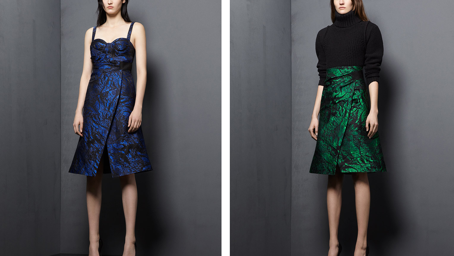
Case in point Proenza Schouler (I talk about them a fair bit don't I?): what was their inspiration for Pre-Fall '12? Sleeping bag quilting of course! The collection is pretty tiny and to be honest a lot of it was pretty meh, but they used this emerald green and dark navy that's very moody and regal so I'll show you those looks:


On the other end of the scale, Chanel delivered a pre-fall collection that was huge (78 looks) and much better than any collection Karl Lagerfeld has made in the last five years (at least). Old Karl was tired of everyone looking to China and Japan and stuff, and so being the envelope pusher that he is, did something <sarcasm>totally different<sarcasm> and looked to India of all places! I don't think he understands that the reason that fashion has focused on China lately is that they are having a huge middle-class economic boom, not because of some lame-ass cultural appropriation 'creative' reason. Lagerfeld himself has never even been to India, so insults the country by confusing their culture with douchebaggy students from 2001 who travel there to find spirituality or whatever (there were dreadlocks, it was terrible).
I guess it's kind of good then that this collection was met with some outrage! HOWEVER. It was outrage for the totally wrong reason. While the critics should have been getting all angsty about the condescending way that European/North American designers routinely borrow from, and homogenize, 'exotic' cultures, instead they were getting riled up about how extravagent the whole show and collection was. Because of the current economic situation in Europe. Because it's rude or something (totally not rude to India btw).

And so all things considered, I feel a little bit conflicted about the fact that - I really liked some of the collection. Chanel collections are always way too big for everything to be a hit, and more than half of this one was a miss, but what he got right here he got SO RIGHT. I didn't have a problem with all the extravagance (yeah yeah I'm contrary), so all those dripping jewels and gold embroidery satisfied the princess inside of me  (a lot of girls have this). A sari is far more fitting for a princess than any stupid pink taffeta. Here are the looks that are good, while bearing in mind that originally there were 78:


As a p.s. here is one look that didn't fit in with anything else, but the colours of the stripes and that navy are just so satisfying it makes me smile and sigh. Also Julia Nobis always gets the best, baddass looks.


27.12.11

An Ode to One's Bed

It is obvious now that when I said, over a month ago, that I was going to be "very sporadic" in my posting, I was very much lying. Not that I knew it at the time, but a lie nonetheless.

But that's ok! I'm back now! In celebration this post is about the thing that one (a.k.a. me) tends to dream about when sleeping on couches and uncomfortable trundler beds when you are overseas and have no say about where you sleep: your own bed.
One's own bed is a very special thing. You may not have spectacular linen and a fabulous mattress and a bronzed bed frame, but it is yours and it is where you rest each night and thus it is important. Beds, in my opinion, also radiate a special sort of calm. Looking at a photograph of a bed (in a bedroom, that is an essential) can be quite meditative, very peaceful. And World of Interiors, of course, produce the best, most peaceful photos of beds out.

So put on some jazz or white noise and peruse through these...