Showing posts with label Art. Show all posts
11.10.13
5.6.13
Penn; Flowers
Not Sean! Although I will forgive you for thinking that. Here we're talking about Irving, and here we're talking about flowers. Glorious, glorious flowers. As one commenter said on a random forum "nice lighting, good photos". Quite.
Saw these beauties in the Diana Vreeland documentary (which, if anything, has taught me it's deeee-anna, not die-anna) during one of the many swooping shots of opened magazine pages. In most of those shots I dived for the pause button - if only Harper's Bazaar had an online archive like Vogue...
But gawd I mean really. These were commissioned for a fashion magazine? Not to put fashion magazines down, but goodness that's radical. Including original work from a fine artist, even one who works most of the time in fashion photography, would be unthinkable in most major monthlies these days. It was unthinkable back then! But that's what makes Vreeland the visionary she was.
Voila! Des fleurs! (Les fleurs? Whatever)
Saw these beauties in the Diana Vreeland documentary (which, if anything, has taught me it's deeee-anna, not die-anna) during one of the many swooping shots of opened magazine pages. In most of those shots I dived for the pause button - if only Harper's Bazaar had an online archive like Vogue...
But gawd I mean really. These were commissioned for a fashion magazine? Not to put fashion magazines down, but goodness that's radical. Including original work from a fine artist, even one who works most of the time in fashion photography, would be unthinkable in most major monthlies these days. It was unthinkable back then! But that's what makes Vreeland the visionary she was.
Voila! Des fleurs! (Les fleurs? Whatever)
images from all over the show, but original source is late sixties, early seventies issues of Vogue
11.4.13
Proenza and Schouler and Divola and Dance, Together
Boy, they sure ain't kidding when they say fashion moves fast. Not a month since New York Fashion Week this Document Journal editorial springs up, influenced by Proenza Schouler's F/W2013 Collection. To be precise it's not exactly influenced by the collection, but by Jack and Lazaro's own influence for the collection (which is somewhat dubiously related to the resulting clothes), photographer John Divola's Zuma series.
The menacing mood, surreal lighting, and the state of disrepair of the location have all been toned down for the editorial, but a sanitized spirit of Divola's California-in-decay still remains. In the hands of a lesser stylist the concept could have seemed derivative or gimmicky, but as usual stylist Stevie Dance manages to capture - or create - the spirit of the times while producing something that looks and feels completely unique. Dance is exceptional for her ability to make high fashion look, if not "street" exactly, less like the wardrobes of bankers'-wives and more creatively and culturally relevant - as well as oddly wearable.
Unlike those editorials which literally re-present entire looks from a collection, in the exact same spirit and narrative of their show, Dance reinvents the context and attitude of clothes so that it's harder to pinpoint which designer or collection a look comes from. Essentially Dance has unusually great creative influence for a stylist, she influences how an audience interprets clothes rather than merely offering them up for view.
But back to Divola, better not forget Zuma itself:
But referencing the Zuma series is all pretty controversial at the moment. Divola himself is a little miffed by the extent to which his work keeps "inspiring" shoots like these. Before the Zuma series was an influence for Jack and Lazaro's Winter 2013 Collection, it was directly riffed off for the Spring 2013 Campaign. So this editorial is a little stupid on Document Journal's behalf - or not of course, they could have already known about the controversy, and any press is good press yadda yadda.
Unlike those editorials which literally re-present entire looks from a collection, in the exact same spirit and narrative of their show, Dance reinvents the context and attitude of clothes so that it's harder to pinpoint which designer or collection a look comes from. Essentially Dance has unusually great creative influence for a stylist, she influences how an audience interprets clothes rather than merely offering them up for view.
But back to Divola, better not forget Zuma itself:
But referencing the Zuma series is all pretty controversial at the moment. Divola himself is a little miffed by the extent to which his work keeps "inspiring" shoots like these. Before the Zuma series was an influence for Jack and Lazaro's Winter 2013 Collection, it was directly riffed off for the Spring 2013 Campaign. So this editorial is a little stupid on Document Journal's behalf - or not of course, they could have already known about the controversy, and any press is good press yadda yadda.
Document Journal editorial from Fashion Gone Rogue
John Divola images from his website
Proenza Schouler campaign from the depths of the web
Labels:
Art,
Campaigns,
Editorials,
John Divola,
Meghan Collison,
Photography,
Proenza Schouler,
Stevie Dance
23.1.13
Shelley Jacobson
Shelley Jacobson is a New Zealand artist whose photographic works are about environments, both urban and natural, altered and untouched. A lot of the photographs have the same effect on me as standing above a great height, they are overwhelming and I have this urge to jump. Obviously I can't jump into a photograph, but with their big empty spaces these photos are still almost physically compelling. As for those great heights, needless to say I'm afraid of them.
In New Zealand Jacobson travels to areas that have been altered by humans, such as mines and quarries, and documents these wounds on, and healing of, natural landscapes.
Jacobson's work in Japan focuses on the intimate urban landscape. Here the man-made landscape is framed by its natural environment, or in my favourite photograph, (wo)man frames the natural. In the portrait of the tree you can see a little golden plaque on its trunk. That is there to explain that the tree was damaged by, yet survived, one of the atomic bombs. Apparently there are these trees in various locations in Japan all with their own plaques. I guess they are symbols of hope and resilience, and in the context of Jacobson's work it is symbolic on a dual level; for both nature and humans.
The theme of destruction follows through to even completely natural landscapes. The Sea of Trees series documents, in Jacobson's words, "the Japanese suicide landmark Aokigahara-jukai" and its "socially constructed spatial boundary". So even in the natural the human leaves an horrific mark, albeit not a physical one.
While this knowledge about the meaning and intent behind the work can enrich the viewing experience, the first encounter with these photographs is incredibly evocative without any context. It's almost a shame that I explained to you their meaning first. Free of any figures, Jacobson's photos have that same still, peaceful quality that I've talked about before with interiors photography. But instead of this absence creating an absence of meaning, more possibilities are actually created for the viewer. In the absolute stillness of these images I can hear myself crunching through the snow and foliage of the trees, or the echo of a stone being thrown into the goldmine.
Jacobson has called her approach at times "consciously mundane and systematic", but far from this resulting in sterile images, they are curiously compelling and personal.
In New Zealand Jacobson travels to areas that have been altered by humans, such as mines and quarries, and documents these wounds on, and healing of, natural landscapes.
Jacobson's work in Japan focuses on the intimate urban landscape. Here the man-made landscape is framed by its natural environment, or in my favourite photograph, (wo)man frames the natural. In the portrait of the tree you can see a little golden plaque on its trunk. That is there to explain that the tree was damaged by, yet survived, one of the atomic bombs. Apparently there are these trees in various locations in Japan all with their own plaques. I guess they are symbols of hope and resilience, and in the context of Jacobson's work it is symbolic on a dual level; for both nature and humans.
The theme of destruction follows through to even completely natural landscapes. The Sea of Trees series documents, in Jacobson's words, "the Japanese suicide landmark Aokigahara-jukai" and its "socially constructed spatial boundary". So even in the natural the human leaves an horrific mark, albeit not a physical one.
While this knowledge about the meaning and intent behind the work can enrich the viewing experience, the first encounter with these photographs is incredibly evocative without any context. It's almost a shame that I explained to you their meaning first. Free of any figures, Jacobson's photos have that same still, peaceful quality that I've talked about before with interiors photography. But instead of this absence creating an absence of meaning, more possibilities are actually created for the viewer. In the absolute stillness of these images I can hear myself crunching through the snow and foliage of the trees, or the echo of a stone being thrown into the goldmine.
Jacobson has called her approach at times "consciously mundane and systematic", but far from this resulting in sterile images, they are curiously compelling and personal.
all images from Shelley Jacobson's website
Labels:
Art,
Japan,
New Zealand,
Photography,
Shelley Jacobson,
Women
24.11.12
Henry Diltz, the Seventies, and Beautiful Ugly Dudes
The Auckland Art Gallery (where I work) has this show on at the moment Who Shot Rock and Roll, and I was pretty skeptical and dismissive of it at first because it is so obviously a crowd-pleaser, and, you know, meant to draw in those crowds. I also thought maybe it would be a bit cheesy? Like embarassingly baby-boomerish or something (there is a lot of Mick Jagger in there). But then I saw it for the first time and, damnit, it's pretty cool. I'm slowly falling in love with Elvis Presley (who really reminds me of R-Patz!) and I wish this was the first photo I'd ever seen of Amy Winehouse, because she looks so tough and soft and mysterious all at the same time, and I would have thought to myself "who is this person? Man I really have to hear her stuff". Instead my initiation into Winehouse was a retail job where the other shop girls played her on repeat all day, every day. They ruined her for me before there was a chance.
But by far my favourite inclusion in the exhibition is a slideshow of something like 80 photographs from Henry Diltz. I didn't realise before this exhibition, but Diltz is the author of some of my favourite music photographs of all time. He is special because he takes Crosby, Stills and Nash (and Young!) - some of the ugliest dudes in rock ever (second maybe to Spinal Tap) - and can make them look angelic and serene.
Ok maybe David Crosby is always pretty hairy and goofy looking, but you don't notice so much in Diltz's photographs. Just look at these photos to realise what feats Diltz achieves in the portraits above.
Diltz took huge amounts of photos of Neil Young, who I am just going to go out and say is my number one favourite musician ever. And the first photo in this next series is my favourite photo of him.
Richard Pryor, David Cassidy and Jackson Browne are some of the others who were photographed by Diltz. Who knows how that David Cassidy photo came about but it's hilarious. And, well, Pryor could do anything and it would be hilarious.
He also makes those photos in which you catch yourself getting nostalgic for, and wishing you were in, the seventies. Which is all very silly for you to do because you never experienced the seventies and it didn't have the internet for god's sake. But still, it's a special kind of photo which does that to you. In these photos you can almost hear that folk-rock soundtrack.
Aaaaand let's finish with adorable animal photographs. What guys.
But by far my favourite inclusion in the exhibition is a slideshow of something like 80 photographs from Henry Diltz. I didn't realise before this exhibition, but Diltz is the author of some of my favourite music photographs of all time. He is special because he takes Crosby, Stills and Nash (and Young!) - some of the ugliest dudes in rock ever (second maybe to Spinal Tap) - and can make them look angelic and serene.
Ok maybe David Crosby is always pretty hairy and goofy looking, but you don't notice so much in Diltz's photographs. Just look at these photos to realise what feats Diltz achieves in the portraits above.
Diltz took huge amounts of photos of Neil Young, who I am just going to go out and say is my number one favourite musician ever. And the first photo in this next series is my favourite photo of him.
Richard Pryor, David Cassidy and Jackson Browne are some of the others who were photographed by Diltz. Who knows how that David Cassidy photo came about but it's hilarious. And, well, Pryor could do anything and it would be hilarious.
He also makes those photos in which you catch yourself getting nostalgic for, and wishing you were in, the seventies. Which is all very silly for you to do because you never experienced the seventies and it didn't have the internet for god's sake. But still, it's a special kind of photo which does that to you. In these photos you can almost hear that folk-rock soundtrack.
Aaaaand let's finish with adorable animal photographs. What guys.
all images from Morrison Hotel Gallery
20.10.12
Lounge Room Tribalism
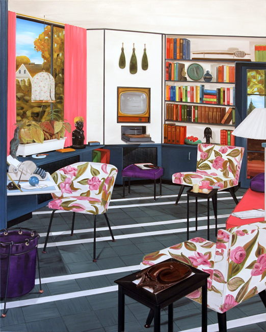
A wee break from back to back super 100% fashion posts. I'll never suffer from fashion fatigue but I can't presume that you lovely readers are the same. So some neat paintings instead. These are all from New Zealand painter Graham Fletcher's Lounge Room Tribalism series.
If you're chilling out in Auckland, you can see some of these in person at the Auckland Art Gallery - but be quick! They are leaving on Monday!
all images from Graham Fletcher's website
25.8.12
Pari Dukovic - Art and Fashion #6
I have a handful of blogs that I read daily, and The New York Times' The Cut would have to be my favourite. I knew that they would be unveiling a new overhaul soon, but I was happily surprised to discover that the day has arrived! And if the first feature is anything to go by, this incarnation will a be a roaring success.
To kick off the new feature - a super-large-format, high-resolution image slideshow - is a series of 63 photographs from Pari Dukovic, taken over the F/W 2012 fashion month. I am totally amped about Pari Dukovic at the moment. He seemed to come out of nowhere the season before with some seriously unusual and seriously compelling show photography. The big fashion photographers of course work in editorial - but this Pari, he's turning shows into an art worthy subject.
Part of what makes the photos so wonderful, and so different, is their texture. I don't know what camera he uses but at times the photos are so grainy they look sketched. How refreshing is it to be reminded of the materiality of a photograph! Ironic, I know, since I'm seeing these on a computer screen, but you can just imagine their physical glory.
For those of us who, like me, only experience these events through pictures, Dukovic's photographs create a world even more fantastical and evocative than before. Who would want to attend the reality of a show when you can attend Dukovic's more sublime vision of reality!
To kick off the new feature - a super-large-format, high-resolution image slideshow - is a series of 63 photographs from Pari Dukovic, taken over the F/W 2012 fashion month. I am totally amped about Pari Dukovic at the moment. He seemed to come out of nowhere the season before with some seriously unusual and seriously compelling show photography. The big fashion photographers of course work in editorial - but this Pari, he's turning shows into an art worthy subject.
Part of what makes the photos so wonderful, and so different, is their texture. I don't know what camera he uses but at times the photos are so grainy they look sketched. How refreshing is it to be reminded of the materiality of a photograph! Ironic, I know, since I'm seeing these on a computer screen, but you can just imagine their physical glory.
For those of us who, like me, only experience these events through pictures, Dukovic's photographs create a world even more fantastical and evocative than before. Who would want to attend the reality of a show when you can attend Dukovic's more sublime vision of reality!
all images by Pari Dukovic (duh) from The Cut
Subscribe to:
Posts (Atom)


.jpg)