Showing posts with label Campaigns. Show all posts

31.7.13

Designers who are Giving me a Headache

Aaaaaargh so I haven't had access to mine own computer for the last little while, which means I haven't been posting because my sister's laptop doesn't have photoshop and you wouldn't believe how much low level photoshop I use in all of my posts. So I've browsed through all my drafts and chosen the one which will be easiest to do without the ol 'shop. Basically, Raf Simons and Hedi Slimane are giving me a real headache at the moment.

Firstly, Slimane. There are so many reasons I shouldn't like Hedi Slimane at Saint Laurent, but god his art direction cannot be denied! It trumps any short-comings in other areas, such as design and attitude. Popping Cara in front of that window, bringing back the skinny musician male bob, accompanying it with shoegazey Interpol nostalgia, it makes me understand the vision that is Saint Laurent Ready-to-Wear 2013. I'm feeling that neo-neo-nineties now instead of looking on incredulously. He's wily and cleaver, and because of it (and despite it) he's starting to grow on me.


And then Amanda Seyfried, who has gone kinda badass since she's been promoting Lovelace (which I am super psyched for because that one clip on Youtube is awesome) is wearing the starry cardigan in Elle and she looks an absolute dream. All thanks to Hedi.


And then there is Simons who I have always adored but who is also responsible for all of the half 'n' half pants at the moment. I am trying really hard to be supportive of Simons because it is undeniable that he is basically fashion's future. That is a cliche but I mean it: he is the future. And currently he is getting that future sorted, but gosh with Spring 2013 Couture he's making it very hard for me to believe in him. Yes you are freeing up couture but does it need to be so uncomfortable looking? I do believe that he's on his way to achieving his aims. But I don't have to like every step of the process.


Anyway, the two of them are keeping me very confused. I guess what one should probably take from this is that the world isn't black and white, but uh, grey. The last time I learnt that lesson (man this one's really not sticking with me) was from reading the last book in A Series of Unfortunate Events. If, like me, you stopped being a pre-teen, tween, teenager and "young adult" in the time between Lemony Snicket writing the first and last book then you probably never reached the end. I think I petered out around 10 or 11. But you should read those remaining books! I sure am glad that last year I got back on that horse again because I learnt a very good lesson about how the world is not divided into good and bad, but rather good shaded with bad and bad shaded with good. If only I had remembered that, and I could have applied it to Hedi (bad shaded with good) and Raf (good shaded with really, really bad).

29.6.13

On the Beach

The clothes in Marc Jacobs Resort could be good or bad, I'm not sure, because the photographs are just so darned entrancing. The models are airbrushed like white dolls and their passive, reclining poses make me think of that Prada campaign. It is also so strange to see Marc Jacobs images that aren't shot by Juergen Teller. I couldn't quite put my finger on what was nagging me about these photos - and what has been nagging me about all MJs resort images - but then it came to me: "no Jeurgen!". It feels like an alternate universe Marc Jacobs, with slightly more odd and slightly less funny.


Ever a genius with colour, Marc's outdone himself this time. I can't believe I've lived this long without being introduced to the wonders of golden syrup and brown, black and carob, and pastel yellow and purple. And since we're on the topic, OH MY GOD I AM SO EXCITED for Luella's return to design. And at Marc by Marc! It's perfect! She'll be fun and quirky and whatnot, hopefully not creatively crushed by working under a label not her own. Oooh next post will be a Luella tribute, since I didn't have the opportunity to do one when her label closed since this blog didn't exist then. 

And how could I forget? Here is the legendary-amongst-campaign-enthusiasts Prada Spring 2001 campaign. For some reason it is v. hard to find good images from this campaign online, these scanned ones are the best I can do.


Resort images from vogue.com

11.4.13

Proenza and Schouler and Divola and Dance, Together

Boy, they sure ain't kidding when they say fashion moves fast. Not a month since New York Fashion Week this Document Journal editorial springs up, influenced by Proenza Schouler's F/W2013 Collection. To be precise it's not exactly influenced by the collection, but by Jack and Lazaro's own influence for the collection (which is somewhat dubiously related to the resulting clothes), photographer John Divola's Zuma series.


The menacing mood, surreal lighting, and the state of disrepair of the location have all been toned down for the editorial, but a sanitized spirit of Divola's California-in-decay still remains. In the hands of a lesser stylist the concept could have seemed derivative or gimmicky, but as usual stylist Stevie Dance manages to capture - or create - the spirit of the times while producing something that looks and feels completely unique. Dance is exceptional for her ability to make high fashion look, if not "street" exactly, less like the wardrobes of bankers'-wives and more creatively and culturally relevant - as well as oddly wearable.

Unlike those editorials which literally re-present entire looks from a collection, in the exact same spirit and narrative of their show, Dance reinvents the context and attitude of clothes so that it's harder to pinpoint which designer or collection a look comes from. Essentially Dance has unusually great creative influence for a stylist, she influences how an audience interprets clothes rather than merely offering them up for view.

But back to Divola, better not forget Zuma itself:


But referencing the Zuma series is all pretty controversial at the moment. Divola himself is a little miffed by the extent to which his work keeps "inspiring" shoots like these. Before the Zuma series was an influence for Jack and Lazaro's Winter 2013 Collection, it was directly riffed off for the Spring 2013 Campaign. So this editorial is a little stupid on Document Journal's behalf - or not of course, they could have already known about the controversy, and any press is good press yadda yadda.


Document Journal editorial from Fashion Gone Rogue
John Divola images from his website
Proenza Schouler campaign from the depths of the web

23.12.12

Ads, Beautiful Ads

Since it's well and truly the Christmas season now, I thought it would be topical to do a post on advertising and consumption (haha). But actually, advertising in fashion magazines is an interesting and contentious subject. We've all been there haven't we? Someone has picked up one of our magazines and scoffed, scorned us at the amount of advertising in its pages, something along the lines of "I've counted, and it's 167 pages before the masthead!". Now I ain't gonna defend that! It's true! There are a lot of ads in fashion magazines. But what these people (these people) don't understand is that unlike, say, an ad for Neutrogena, the ads that labels put in fashion magazines are much, much more than just ads. To put it simply, they are campaigns. 
There. In that one word they are declared as different. Because while these images from the new Heidi Slimane helmed Saint Laurent Paris are of course trying to sell us something, they are also a creative outlet for a fashion house to further express exactly what they are all about.


In these images, creatives have even more control over their image, or aesthetic ("aesthetic" sounds far more creatively driven than the commercial "image" doesn't it?) than they do at shows. They help show what the collection is all about, what the designer was thinking, what his influences were. This Saint Laurent campaign in particular is an excellent example of the power of fashion's campaign image. Sent down the runway, the clothes looked like above average examples of a stylish LA lady. To be honest I was a bit embarrased for Slimane. But here, here I get it. It's about being androngynous and slinky, and pared back but not minimal as we know the term, and about clean lines and black and white. The images also convey, very succinctly, that Slimane is making huge changes at this house, that he is placing Saint Laurent at the front of the new change towards the new-minimalism, simplified-but-not-simple luxury aesthetic. Just compare this latest campaign to Winter 2012, when Stefano Pilati was head designer - anyone could tell that with Slimane, something's afoot.


And it is absolutely no mistake that he released campaign images before he even showed his first full collection. Art and design isn't just about objects guys, it's also about feeling. 

Miu Miu have also just released their Spring Summer 2013 campaign, and as with Saint Laurent, they have made everything make so much sense. Crinkly denim pencil skirts look so much more appealing now.


Still lifes! Or accessories advertising. Whatever.


Saint Laurent images from The Cut
Miu Miu images from Fashion Gone Rogue

25.7.12

Balenciaga Etc

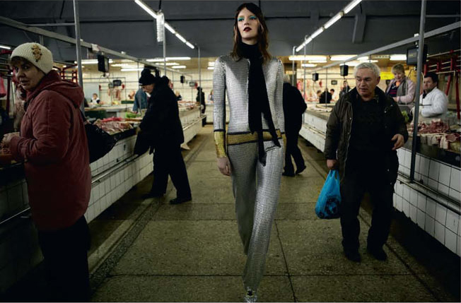
These images aren't really all that connected, except that they make me think of each other for some reason, maybe it's just the mood and vibes. A common complaint is that fashion magazines have copious ads, but I have to say that I love me a good campaign and I enjoy flicking through advertising as long as the images are interesting. These Balenciaga and Pringle of Scotland campaigns do it for me. RIP Alistair Carr at Pringle - you could have done great things.


While we're at it I am going to have to throw in last season's Balenciaga campaign too, because it is one of my favourite ever. I didn't like the collection all that much until I saw these pictures, and then it all made sense. It's so satisfying when a campaign can pull everything together, clarify everything in a way that runway can't do on its own.


I'm also including here, only because it seems related for reasons I can't quite say, a recent Dazed and Confused editorial. I guess this is a pretty lazy post - I'm just gonna post some images that I like cuz I can! - but I swear there is something going on here! Future dressing! New aesthetics! Something!


Balenciaga images from balenciaga.com
Dazed and Confused images from Fashion Gone Rogue