Showing posts with label Marc Jacobs. Show all posts
4.9.13
29.6.13
On the Beach
The clothes in Marc Jacobs Resort could be good or bad, I'm not sure, because the photographs are just so darned entrancing. The models are airbrushed like white dolls and their passive, reclining poses make me think of that Prada campaign. It is also so strange to see Marc Jacobs images that aren't shot by Juergen Teller. I couldn't quite put my finger on what was nagging me about these photos - and what has been nagging me about all MJs resort images - but then it came to me: "no Jeurgen!". It feels like an alternate universe Marc Jacobs, with slightly more odd and slightly less funny.
Ever a genius with colour, Marc's outdone himself this time. I can't believe I've lived this long without being introduced to the wonders of golden syrup and brown, black and carob, and pastel yellow and purple. And since we're on the topic, OH MY GOD I AM SO EXCITED for Luella's return to design. And at Marc by Marc! It's perfect! She'll be fun and quirky and whatnot, hopefully not creatively crushed by working under a label not her own. Oooh next post will be a Luella tribute, since I didn't have the opportunity to do one when her label closed since this blog didn't exist then.
And how could I forget? Here is the legendary-amongst-campaign-enthusiasts Prada Spring 2001 campaign. For some reason it is v. hard to find good images from this campaign online, these scanned ones are the best I can do.
Resort images from vogue.com
Labels:
Campaigns,
Collections,
Luella Bartley,
Marc Jacobs,
Prada,
Resort 2014
24.5.13
Take me Back to '06
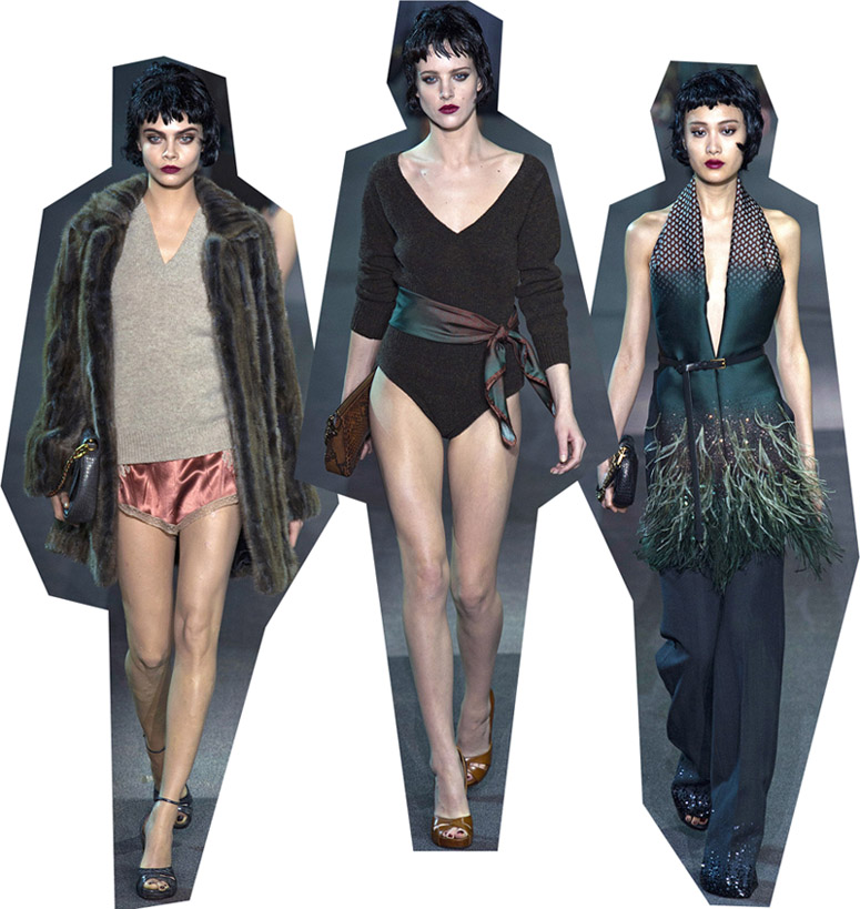
Guys, Louis Vuitton this season reminded me what it was like to be 14 again and totally excited about, totally falling in love with fashion for the first time. Looking at the show I was back in February 2006; youtube was brand new and my 14-year-old self was completely transfixed by Marc Jacob's Fall 2006 show video. I'd never looked at a whole collection before and the knitted mushroom hats, the plaid, the strange layering and silhouettes and the mixes of flannel and sequins were all both completely new and utterly intoxicating. There was a theatrical element to that collection, the clothes dealt more with fantasy than reality perhaps (completely unlike the clothes populating my second-to-last post), and rather than simply existing unto themselves, everything was a signifiier for something else. I saw grunge in the plaid (obviously) and that particular early 00s feminist spirit in those sequins. These deeper elements have always gotten me most excited about fashion, despite striving to be more aloof and sophisticated at times - although at these moments as consolation I tell myself that these are the sorts of collections that Grace Coddington loves too.
Nothing has been as exciting as that Marc Jacob's collection in a long time. But MJ has done it again, and Louis Vuitton was super exhilirating. Like stage clothes but not, they conjure up images of so much. If you've never seen Belle de Jour before, if you know nothing about femme fatales and Catharine Deneuve and even, I don't know, France and French ladies, and nothing about simultaneously empowering and self-objectifying sexuality, then I believe you could understand it all just by watching this collection. Or if we were to avoid exaggeration, you could at least begin to understand all of these things in that hard-to-pin-down aesthetic and vibey way.
In fact I'm going to argue that Jacobs was even more successful than Prada at giving us not just clothes but a story and a plot. Every reviewer for Prada went on about the set and show atmosphere, which leads me to think that perhaps it was the whole experience that was more successful than the collection itself, and it was the experience that intoxicated those reviewers present. Because Prada's clothes were not nearly as evocative and in tune with the overall mood as these.
But gosh the collection requires multiple viewings, if only to nut around how Jacobs has covered the 1930s, 40s, 50s, 60s and 70s and managed to make it so specifically cohesive. Speaking of the 70s, I love the conversations that inevitably occur between Marc Jacobs and Louis Vuitton each season. In fact I didn't click with MJ until I saw LV. I wasn't feeling that collection at all, and now some of the looks are my favourite of the season. Dance and sequins and Minnelli and fur and v-necks, of course!
But back to Louis V., this is the kind of collection that makes me want fashion to slow down. As sure as night follows day come September, Spring 2014 will show, and all attention will turn to what Jacobs does next. Winter 2013 will be old news. But I don't want it to be old news! I want magazines to be writing about it and photographing it for years to come! I want people to stew and find new ways to interpret the marabou trimmed coats and floor-skimming slips! Plz can it just be forever?
You were thinking this was going to be a Jacobs-exclusive post weren't you? Ha! I'm going to throw in some Marni seemingly last minute to stir things up a bit. Because there were some wonderful similarities between Marni and Louis V. You may remember that last season Marni had a transformation of sorts. Critics liked to say that the house had "grown up" but I didn't believe that becoming more restrained and comparatively minimal constitutes growing up, and besides, I liked the old Marni better. Or so I thought! I can now stop complaining about Marni's new look (to deaf ears, mind you), because boy was Winter 2013 wonderful. A lot of what I said about Louis Vuitton applies here. Although because this is Milan, not Paris or New York, the moodiness is a touch darker, and a touch more earnest.
Folk tales and bears in the woods and all that. Highlights including massive fur stoles dyed in a moody rainbow of colours, topped off by dripping-blood lips and sensible sandals.
Oh, and by the way, this is my 100th post! Happy blog day! Or something. To celebrate, a fitting celebratory image.
Nothing has been as exciting as that Marc Jacob's collection in a long time. But MJ has done it again, and Louis Vuitton was super exhilirating. Like stage clothes but not, they conjure up images of so much. If you've never seen Belle de Jour before, if you know nothing about femme fatales and Catharine Deneuve and even, I don't know, France and French ladies, and nothing about simultaneously empowering and self-objectifying sexuality, then I believe you could understand it all just by watching this collection. Or if we were to avoid exaggeration, you could at least begin to understand all of these things in that hard-to-pin-down aesthetic and vibey way.
In fact I'm going to argue that Jacobs was even more successful than Prada at giving us not just clothes but a story and a plot. Every reviewer for Prada went on about the set and show atmosphere, which leads me to think that perhaps it was the whole experience that was more successful than the collection itself, and it was the experience that intoxicated those reviewers present. Because Prada's clothes were not nearly as evocative and in tune with the overall mood as these.
But gosh the collection requires multiple viewings, if only to nut around how Jacobs has covered the 1930s, 40s, 50s, 60s and 70s and managed to make it so specifically cohesive. Speaking of the 70s, I love the conversations that inevitably occur between Marc Jacobs and Louis Vuitton each season. In fact I didn't click with MJ until I saw LV. I wasn't feeling that collection at all, and now some of the looks are my favourite of the season. Dance and sequins and Minnelli and fur and v-necks, of course!
But back to Louis V., this is the kind of collection that makes me want fashion to slow down. As sure as night follows day come September, Spring 2014 will show, and all attention will turn to what Jacobs does next. Winter 2013 will be old news. But I don't want it to be old news! I want magazines to be writing about it and photographing it for years to come! I want people to stew and find new ways to interpret the marabou trimmed coats and floor-skimming slips! Plz can it just be forever?
You were thinking this was going to be a Jacobs-exclusive post weren't you? Ha! I'm going to throw in some Marni seemingly last minute to stir things up a bit. Because there were some wonderful similarities between Marni and Louis V. You may remember that last season Marni had a transformation of sorts. Critics liked to say that the house had "grown up" but I didn't believe that becoming more restrained and comparatively minimal constitutes growing up, and besides, I liked the old Marni better. Or so I thought! I can now stop complaining about Marni's new look (to deaf ears, mind you), because boy was Winter 2013 wonderful. A lot of what I said about Louis Vuitton applies here. Although because this is Milan, not Paris or New York, the moodiness is a touch darker, and a touch more earnest.
Folk tales and bears in the woods and all that. Highlights including massive fur stoles dyed in a moody rainbow of colours, topped off by dripping-blood lips and sensible sandals.
Oh, and by the way, this is my 100th post! Happy blog day! Or something. To celebrate, a fitting celebratory image.
Labels:
Autumn/Winter 2006,
Autumn/Winter 2013,
Louis Vuitton,
Marc Jacobs,
Marni,
Milan,
New York,
Paris,
Prada,
Reviews,
Runway
15.10.12
Altuzarra
This post was going to be about Marc Jacobs, how it was one of my favorites of New York, but in the time it's taken me to get around to it I have completely gone off it. Perhaps it's because I saw the Louis Vuitton show, hated it, and then realised how similar it was to MJ. And at first I could look past the whole Edie Sedgwick thing, but OH GOD HOW I HATE HER and I just can't do it anymore.
So instead I'm gonna talk about Joseph Altuzarra! If you consider a collection as a single statement, yet made up of multiple parts - kind of like a music album or an artists' series - then here Altuzarra created a damned near-perfect collection. There was serious growth. There were also variations on a theme. But then if you placed the earlier looks with the later, the connection is not obvious at all. Yet overall, the whole collection fit perfectly together and was cohesive. I've said it before and I'll say it again, cohesion is what makes a good collection - and then cohesion made up of divergent parts is what makes a collection great.
I really dug the Carhartt-esque jackets with little Altuzarra logos, as well as the printed jean(?) skirts and blue shirts. It seems, to borrow a phrase, just so fresh and so clean. Clothes that I want to wear as well as simply admire and write about. Because let's be honest, I go nuts about Alexander McQueen but I will never want to wear it.
And then things get SERIOUS with the draping and the wrapping and the folding and all the beautiful detailing (that little panel on the green dress makes the outfit). One review said it headed into couture territory and I'd agree. And the blue-white combination of the earlier looks are repeated here, but changed to a darker, more intense blue and cream instead of white. Ugh I just LOVE subtle themes that run through collections.
The last looks tossed out practicality altogether, but I really hope that we see at least some rich socialites wearing these in the social pages and in the Sartorialist or whatever. They are too beautiful not to be worn, especially in moody, evening lighting where the gold tassles get highlighted and sparkle. I'd also like to say that the generally "ethnic" vibes are ok because Altuzarra is not directly referencing or copying any particular traditional dress. But there are always some who'd disagree on that.
That "ethnic" wrapping and draping had parallels with an unusually good Marc by Marc Jacobs collection. It doesn't make up for other disappointments, but it was a nice surprise.
So instead I'm gonna talk about Joseph Altuzarra! If you consider a collection as a single statement, yet made up of multiple parts - kind of like a music album or an artists' series - then here Altuzarra created a damned near-perfect collection. There was serious growth. There were also variations on a theme. But then if you placed the earlier looks with the later, the connection is not obvious at all. Yet overall, the whole collection fit perfectly together and was cohesive. I've said it before and I'll say it again, cohesion is what makes a good collection - and then cohesion made up of divergent parts is what makes a collection great.
I really dug the Carhartt-esque jackets with little Altuzarra logos, as well as the printed jean(?) skirts and blue shirts. It seems, to borrow a phrase, just so fresh and so clean. Clothes that I want to wear as well as simply admire and write about. Because let's be honest, I go nuts about Alexander McQueen but I will never want to wear it.
And then things get SERIOUS with the draping and the wrapping and the folding and all the beautiful detailing (that little panel on the green dress makes the outfit). One review said it headed into couture territory and I'd agree. And the blue-white combination of the earlier looks are repeated here, but changed to a darker, more intense blue and cream instead of white. Ugh I just LOVE subtle themes that run through collections.
The last looks tossed out practicality altogether, but I really hope that we see at least some rich socialites wearing these in the social pages and in the Sartorialist or whatever. They are too beautiful not to be worn, especially in moody, evening lighting where the gold tassles get highlighted and sparkle. I'd also like to say that the generally "ethnic" vibes are ok because Altuzarra is not directly referencing or copying any particular traditional dress. But there are always some who'd disagree on that.
That "ethnic" wrapping and draping had parallels with an unusually good Marc by Marc Jacobs collection. It doesn't make up for other disappointments, but it was a nice surprise.
all images from vogue.com
14.2.12
Marc Jacobs and Hats
I couldn't avoid writing about the Marc Jacobs show, and even harder to avoid were those hats (badum-tsh). I would like to just put it out there that I thought the hats were in no way funny or artistic or clever or interesting or ironic but they were offensively bad and hugely distracting from the clothes. I would even go as far to say that in the six or so hours since the show, I have outright hated them. If you haven't seen them yet and want to you are going to have to go somewhere else because I'm going to crop out the heads in order to see how the clothes look:
Ah much better. How rad are those embellishments?? Now I don't want to be a drag but overall I prefered the more somber looks. As a whole the more colourful looks seemed too self-consciously zany, a little forced - however that impression could wholly be blamed on those damned hats. Sarah Mower has already made large claims that this collection "reestablished the radical idea that fashion can still be free to be creative and cross over with art". Sure MJ may have collaborated with artist Rachel Feinstein on this one, but I think that fashion and art have more to do together than clashing tinsel (as an aside, do you think the tinsel woven looks were scratchy for the models?).
I liked the more toned-down looks because you could really focus on the completely bananas shapes that were being thrown out. I mean that man can really do things with proportions! And it's nice to see an acknowledgment that women have hips. For me, in black the textures became more luscious too; I wish I could have seen those dark shimmering dresses in person.
Ah much better. How rad are those embellishments?? Now I don't want to be a drag but overall I prefered the more somber looks. As a whole the more colourful looks seemed too self-consciously zany, a little forced - however that impression could wholly be blamed on those damned hats. Sarah Mower has already made large claims that this collection "reestablished the radical idea that fashion can still be free to be creative and cross over with art". Sure MJ may have collaborated with artist Rachel Feinstein on this one, but I think that fashion and art have more to do together than clashing tinsel (as an aside, do you think the tinsel woven looks were scratchy for the models?).
I liked the more toned-down looks because you could really focus on the completely bananas shapes that were being thrown out. I mean that man can really do things with proportions! And it's nice to see an acknowledgment that women have hips. For me, in black the textures became more luscious too; I wish I could have seen those dark shimmering dresses in person.
I did not like paisley at Jil Sander or Stella McCartney but here I've been won over. Perhaps it has something to do with sparkles. A part from shaping, Jacobs also has an innate knack with shine and I for one am incredibly grateful for that.
Labels:
Autumn/Winter 2012,
Marc Jacobs,
New York,
Reviews,
Runway
7.2.12
Blue Marc
Feeling lazy today, so just a couple of nice images from Vogue Japan of a particularly great Marc Jacobs collection. Do you wonder where they shot this? I've got an image of a gang of interns armed with bucketfuls of baby blue paint and the old lion enclosure at Tokyo zoo.
p.s. so excited for shows Thursday!!!
12.10.11
New York SS'12 - Marc Jacobs
The other great collection out of New York was Marc Jacobs, who always puts on a good show but not necessarily one that I like (case in point: last season). You can't see this in most coverage, but it started with a gold curtain revealing the models on a spotlit stage, posed in a jazz-dancehall style scene like something out of All That Jazz; I'm sure the kind of thing that would give you shivers of excitement if you were lucky enough to be in the audience.
Hamish Bowles (of Vogue) wrote in his review "this was not another playful twist on period dressing", referencing the 1970s extravaganza of last Spring, because although there were 1920s-dropped waists and headscarves and gingham and sassy attitudes, there wasn't the same costume element. Extended from the flapper look, a new silhouette emerged out of the tight tops pulled low over equally narrow , long skirts. And with all the cellophane wrapping and shimmering ruffles and gingham it was definitely forward, rather that backward looking.

Over at style.com, Nicole Phelps thought the whole thing "fell a little bit flat" and that the set was more exciting than the clothes. Hmmm. Sure, at first I wasn't at all impressed with the clothes , but I think that the styling was responsible for obscuring some of the individual pieces. The show wasn't styled for consumers to lust over, but I think this sacrifice resulted in, overall, one heck of a show. Maybe part of the reason Phelps didn't like it is that there is definitely something off about it, something totally unusual - which has kept me thinking about it for days.
Finally, let's hand it to those headscarves:
Hamish Bowles (of Vogue) wrote in his review "this was not another playful twist on period dressing", referencing the 1970s extravaganza of last Spring, because although there were 1920s-dropped waists and headscarves and gingham and sassy attitudes, there wasn't the same costume element. Extended from the flapper look, a new silhouette emerged out of the tight tops pulled low over equally narrow , long skirts. And with all the cellophane wrapping and shimmering ruffles and gingham it was definitely forward, rather that backward looking.
Over at style.com, Nicole Phelps thought the whole thing "fell a little bit flat" and that the set was more exciting than the clothes. Hmmm. Sure, at first I wasn't at all impressed with the clothes , but I think that the styling was responsible for obscuring some of the individual pieces. The show wasn't styled for consumers to lust over, but I think this sacrifice resulted in, overall, one heck of a show. Maybe part of the reason Phelps didn't like it is that there is definitely something off about it, something totally unusual - which has kept me thinking about it for days.
Finally, let's hand it to those headscarves:
First photo from models.com
Runway photos from vogue.com
Labels:
Marc Jacobs,
New York,
Reviews,
Runway,
Spring/Summer 2012
Subscribe to:
Posts (Atom)