Showing posts with label Autumn/Winter 2013. Show all posts

30.8.13

Runway to Page

The looks in this editorial are way better here than they even were on the runway. This editorial should be unremarkable but man I love it. What is it about it? Maybe it's the stylist. I looked up the lady responsible, Catherine Newell-Hanson and boy does she kill it on the regular. She does do that annoying thing of reproducing entire looks from a show, but there is magic in the air here so I don't mind. 


images from Fashion Gone Rogue and vogue.com

13.7.13

Fall Fur Frenzy

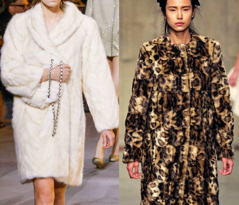
The fur this season was nuts. It was pink! It was blue! It was huge! It was cropped! It was wider than it was tall! It was real! It was fake! It was all this and much more. Fur has emerged gloriously into my consciousness, shedding its past life as the coat material of choice for both oligarchs and London girls with messy hair and a fervent nostalgia. Even though I am a meat eater and leather wearer, I have always, subconciously, without thinking about it too much, believed fur wearing to be a rather immoral activity, leaning towards PETA rather than Anna in these matters. But now that the proliferation of fur on the runway has brought the subject to the fore I'm thinking the matter through, and I've come to the conclusion that it is ridiculous that I eat meat/wear leather etc when I don't do fur. But instead of deciding to give up animal related products, I am going to greet another one with open arms (except for those poor animals which are killed just for their fur. I am not sure which ones these are, and which of these are endangered, but I endeavor to make sure any fur on my back is not it (that is if I ever have enough disposal income to actually buy a fur coat, which won't happen anytime soon)).


all images from vogue.com

24.5.13

Take me Back to '06

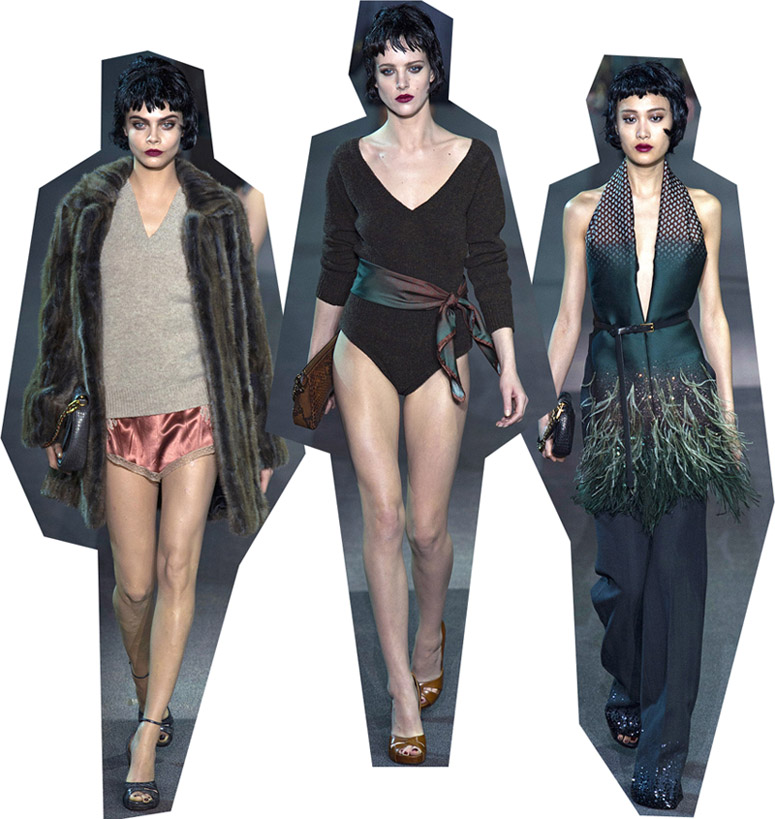
Guys, Louis Vuitton this season reminded me what it was like to be 14 again and totally excited about, totally falling in love with fashion for the first time. Looking at the show I was back in February 2006; youtube was brand new and my 14-year-old self was completely transfixed by Marc Jacob's Fall 2006 show video. I'd never looked at a whole collection before and the knitted mushroom hats, the plaid, the strange layering and silhouettes and the mixes of flannel and sequins were all both completely new and utterly intoxicating. There was a theatrical element to that collection, the clothes dealt more with fantasy than reality perhaps (completely unlike the clothes populating my second-to-last post), and rather than simply existing unto themselves, everything was a signifiier for something else. I saw grunge in the plaid (obviously) and that particular early 00s feminist spirit in those sequins. These deeper elements have always gotten me most excited about fashion, despite striving to be more aloof and sophisticated at times - although at these moments as consolation I tell myself that these are the sorts of collections that Grace Coddington loves too.


Nothing has been as exciting as that Marc Jacob's collection in a long time. But MJ has done it again, and Louis Vuitton was super exhilirating. Like stage clothes but not, they conjure up images of so much. If you've never seen Belle de Jour before, if you know nothing about femme fatales and Catharine Deneuve and even, I don't know, France and French ladies, and nothing about simultaneously empowering and self-objectifying sexuality, then I believe you could understand it all just by watching this collection. Or if we were to avoid exaggeration, you could at least begin to understand all of these things in that hard-to-pin-down aesthetic and vibey way.


In fact I'm going to argue that Jacobs was even more successful than Prada at giving us not just clothes but a story and a plot. Every reviewer for Prada went on about the set and show atmosphere, which leads me to think that perhaps it was the whole experience that was more successful than the collection itself, and it was the experience that intoxicated those reviewers present. Because Prada's clothes were not nearly as evocative and in tune with the overall mood as these.


But gosh the collection requires multiple viewings, if only to nut around how Jacobs has covered the 1930s, 40s, 50s, 60s and 70s and managed to make it so specifically cohesive. Speaking of the 70s, I love the conversations that inevitably occur between Marc Jacobs and Louis Vuitton each season. In fact I didn't click with MJ until I saw LV. I wasn't feeling that collection at all, and now some of the looks are my favourite of the season. Dance and sequins and Minnelli and fur and v-necks, of course!


But back to Louis V., this is the kind of collection that makes me want fashion to slow down. As sure as night follows day come September, Spring 2014 will show, and all attention will turn to what Jacobs does next. Winter 2013 will be old news. But I don't want it to be old news! I want magazines to be writing about it and photographing it for years to come! I want people to stew and find new ways to interpret the marabou trimmed coats and floor-skimming slips! Plz can it just be forever?


You were thinking this was going to be a Jacobs-exclusive post weren't you? Ha! I'm going to throw in some Marni seemingly last minute to stir things up a bit. Because there were some wonderful similarities between Marni and Louis V. You may remember that last season Marni had a transformation of sorts. Critics liked to say that the house had "grown up" but I didn't believe that becoming more restrained and comparatively minimal constitutes growing up, and besides, I liked the old Marni better. Or so I thought! I can now stop complaining about Marni's new look (to deaf ears, mind you), because boy was Winter 2013 wonderful. A lot of what I said about Louis Vuitton applies here. Although because this is Milan, not Paris or New York, the moodiness is a touch darker, and a touch more earnest.


Folk tales and bears in the woods and all that. Highlights including massive fur stoles dyed in a moody rainbow of colours, topped off by dripping-blood lips and sensible sandals.


Oh, and by the way, this is my 100th post! Happy blog day! Or something. To celebrate, a fitting celebratory image.


21.4.13

A Great Collection

J.W. Anderson really moved me this season. And I've had to wait a while to review the collection because it blew me away in a way I didn't understand at all. Since February I've been thinking about it every couple of days, and trying to figure out what makes it a great collection. And I really do mean great! I'm getting the same feelings I had gazing upon Christopher Kane S/S12 or Prada S/S11.

So why was J.W. Anderson so wonderful this season? Perhaps it is to do with that fact it was new in the subtlest and most fundamental sense. It did not feel new because, say, orientalism hasn't been around in a while or it rehashed minimalism or because its influences had not been cited before. It was like a seismic shift - there may not have been an earthquake but you're definitely not standing in the same spot on earth as you were a day ago.


The "newness" could lie in the way that Anderson created fresh forms. Sarah Mower reported that Anderson and his stylist "had been working on a lot of abstract techniques with fabric in the studio on Shacklewell Lane, guided only by whether the results seemed genuinely new to their eyes". Here the necklines creep up, pant legs hang as if wet, skirt hems transform into mere decorative elements, and everywhere lines of fabric were flapping and billowing in unexpected places. While explorations of form often amount to an experimental collection, unwearable in the everyday sense, Anderson hasn't compromised on the real life of the clothes, the fact that they are worn and lived in. Sure some of these looks wouldn't be seen on the street, but the majority would fit in surprisingly well. While I love a designer that pushes the limits of what clothes can be, what I admire most are those clothes that are simultaneously entirely new and entirely practical - which is rarer than you'd think.


Allusions to hospital gowns, arms strapped down by a knitted oversleeve, and lines of fabric flapping loose all conjure images of the psyche ward, emphasised by, as Maya Singer writes, "a fit of derangement" in the form of two comic-print looks. This enhances the contemporary feel, the madness is specific to the volatile teen years and so perhaps speaks to a younger audience. Indeed the deranged, visual shout of the comic-print cameo reminded me of the book by Jeff Daniels of The Mountain Goats, about a psyche ward-ridden teenager who is obsessed with Black Sabbath's Master of Reality.


Having said that, there was ultimately no straightforward narrative to this collection, no story of a girl or a city or a decade. When Maya Singer asked about the "atmosphere of lunacy" Anderson talked about the physical disruption of the clothes' construction rather than narrative - "he spoke not of reality suspension but of architectural suspension". Every review used words like "mysterious" and "puzzling" and "incomprehensible", but rather than being dismissed for being too hard, too opaque, the collection keeps one intrigued.

Before I sign off I also have to quote the last line from Maya Singer's review (man I'm quoting others a lot in this post aren't I?) because when I read it it affirmed my thoughts precisely, I wanted to ring up Singer there and then and say "yes, exactly".

"This collection was interpretable in any number of ways. But the clear takeaway was that it was captivating, original, modern, and great."

31.3.13

Shut Up and Take my Money Phil

Fashion is a unique creative art in that it has a second life as a practicality. One doesn't need to own art or books or movies to function in society, but as soon as you step outside without your clothes on you're going to get in trouble. But because clothes have two lives, as something functional and also as art or design, it can become confusing as to how they should be considered, critiqued, and to which social discussions they belong: commerce? Design? Art? The result is fashion journalism that, while rarely explicitly stating from which angle they are approaching fashion, takes a side nonetheless. Tim Blanks is my favourite writer in the fashion as design/art camp, his pieces are a joy to read in themselves and are incredibly insightful. If you want to "understand" a collection you better hope Blanks has been assigned to review it. On the other end of the spectrum are writers who list elements of the collections, usually accessories, like an inventory, and state things like "outerwear and dresses were the focus point of this collection". Major yawn inducing material.

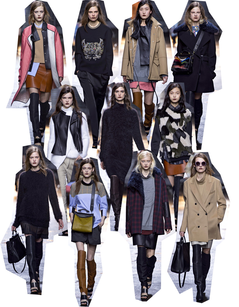
However if I was one of those commercially minded critics, 3.1 Phillip Lim would have most definitely satisfied me. And by "commercially minded critic" I mean that outwardly I was saying things like "Lim has cleverly created a collection full of seemingly endless separates that will sit super comfortably on shop hangers and will disappear in a heartbeat", but inside I was just squealing and figuring out how many months it will be until I can price compare it all on Polyvore. I don't get this with The Row or even Proenza Schouler, which is partly because of the price point but mainly because there is something, something that I can't quite put my finger on, that is so buyable about Phillip Lim's collection. I can already see these coats and jumpers and dresses sitting on hangers and shelves so clearly. Here are some of the best looks of the collection, peruse the catalog and start your saving.


23.3.13

Octo Style/NY-JPN

This is a post about the highlights of New York's Winter 2013 fashion week, but I'm going to backtrack a bit to Pre-Fall 2013 to set the scene. Lately at The Row, Mary-Kate and Ashley have been veering occasionally from neu-conservatism elegance into regular old octogenarian elegance. Some of these looks remind me of the final page of all those Vogue "style at any age" features. And there is nothing wrong with advanced style, but rather than the theme of radical restraint of previous The Row collections, on twenty-somethings these clothes seem stale and conservative.


So with Pre-Fall 2013 as a precursor, it was with extra interest and slight apprehension that I took in F/W 2013. In some ways the octo-style theme was continued, with subtly textured creamy gold adorning practical pants and opera-ready shawls. Literally both my grandmas had pants like that.


But in many more ways my fears that The Row had crossed the line for good, from radically conservative to conservative-conservative, were assuaged. They've taken their usual Japanese motifs to new and glorious heights, their all-navy looks wrapped by pseudo-obis, coats nipped and flaring to perfectly shape the body, or tied at the sides, and everything always in a glorious symphony of textures. Of course every designer and his dog has been feeling Japanese lately, but when it comes to the cut and unusual shapes and silhouettes, Mary-Kate and Ashley are more meticulous, more focused, and simply better.


MK and Ashley explained the collection as a mix of Victorian and Japanese dress codes, and while the Victorian element can certainly be found in the modesty of these looks, the combination was even clearer in their set design. The location was an Upper East Side townhouse, and it was decorated in a hushed-elegance sort of way with carefully mismatched antiques and Japanese floral arrangements.


And if grand themes were to be found at New York Fashion Week, an understated and very serious interpretation of elements of Japanese dress was one of them. Proenza Schouler also riffed on the obi, and the folding and wrapping of Japanese dress. The looks which utilized these elements were some of the best, and emphasized the controlled movement of the clothes, a theme that ran through the whole collection. Even the gentle curves of jacket and skirt edges were completely controlled, and moved in a kind of erratic way rather than fluidly.


Many reviews noted that this comparatively sober show was very "grown up" for Proenza Schouler, but I thought the surprised tone was unfounded. Sure Proenza Schouler is synonymous with the young, thin It Girls, but they have always shown collections with undercurrents of the prim and proper, from Spring '09 to Spring '12. Maybe I just hate this particular cliche, but if anyone else claims that Jack and Lazaro have "grown up" I'm gonna get real mad.


The Row images from vogue.com
Interior image from Habitually Chic
Proenza Schouler images from vogue.com and models.com

13.3.13

Oh So Right Altuzarra


At first when I saw Altuzarra I was like, this all looks too uncomfortable and stiff! And then with this photo I got it. It's sexy and uncomfortable and stiff! So stiff in fact that the dresses give empty air an hourglass figure. What felt off in the first viewing has morphed into something that feels so right, and that includes the pink eye/dripping blood makeup, and the clashing fuzzy fur and shiny leather. After all, perfection and easy beauty is too accessible to be truly satisfying. Prada understands that, and Altuzarra seems to too.


first image from The Cut
runway images from vogue.com

28.2.13

Don't Forget the Details

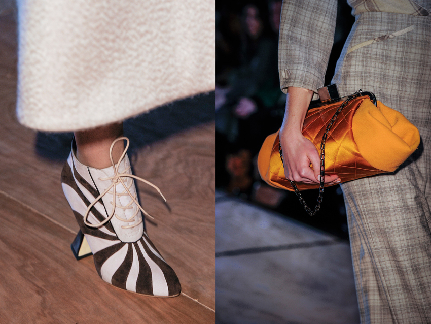
Only ever seeing collections from a computer screen means you can forget about the finer points that makes clothes what they are. Things like movement and the fact that they exist in three-dimensions rather than the two that LED lit pixels afford us. What was it that Grace Coddington said? "On a flat screen, things look flat". The closest us regular folk can get to the real thing are the videos. But in both video and still image, you can still forget about the details. And in cases like the latest, personally disappointing Rodarte show, the clothes actually look better close up than from afar. If I hadn't stumbled across these over at the Self Service website I would not have known the subtler beauty of the collection that consisted of textural contrasts between silk and cotton, tonal contrasts between black and navy, and tiny barbed wire fastenings.


Prompted by Rodarte I've been making a point to look through all the detail shots of every collection, especially ones I'm on the fence for. Unfortunately the lighting at Roksanda Ilincic was bad, or the photographer seems to have used a far too powerful flash, because in the regular runway images the clothes are super washed out.  But hurrah for the detail shots, because here the true hues shine through, as does the luscious detailing.


images from Self Service and Vogue.com