Showing posts with label Rodarte. Show all posts

1.9.13

RODARTE LOVE or HATE TO LOVE #4-5

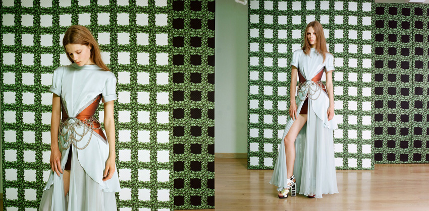
So Rodarte has just relaunched their website. And it is turning my bitter disappointment in their lacklustre collections into a great love. For years now the Rodartes (I know I know they are the Mulleavys, but ever since Grace Coddington referred to them as the Rodartes in The September Issue I can't call them anything else (remember the line? "Those poor Rodartes" - magic)). Woah, let's start that sentence again. For years the Rodartes have been taking beautiful fitting photos for each collection, but as far as I know they've been hidden until now. By having complete creative control of how their collections are presented, outside of the constraints of the runway show, the Rodartes are conveying their intentions far more effectively. I didn't like Fall 2013 or Spring 2012 at all, but thanks to these photos I am now understanding. It's like you are looking into the heads of Kate and Laura and seeing exactly what they see in their clothes.


I want to stress again just how disappointed I was with Spring 2012, the van Gogh one. No longer, these photos are like the phoenix rising through the ashes, disappointment and ambivalence burnt away.


I don't want to just show the collections I have only come to love now. The fitting photos for Spring 2013, the incredible fantasy role playing collection, are the ultimate, and it is a collection that I have always loved and will now love even more. Pseudo action poses lend themselves to ultra staged fittings well!


all images from rodarte.net go there!

28.2.13

Don't Forget the Details

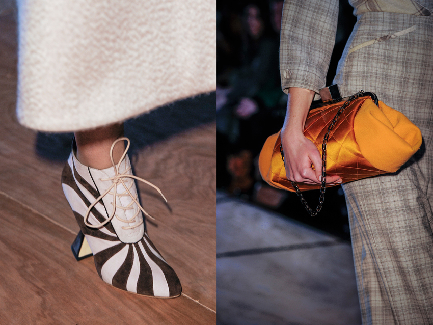
Only ever seeing collections from a computer screen means you can forget about the finer points that makes clothes what they are. Things like movement and the fact that they exist in three-dimensions rather than the two that LED lit pixels afford us. What was it that Grace Coddington said? "On a flat screen, things look flat". The closest us regular folk can get to the real thing are the videos. But in both video and still image, you can still forget about the details. And in cases like the latest, personally disappointing Rodarte show, the clothes actually look better close up than from afar. If I hadn't stumbled across these over at the Self Service website I would not have known the subtler beauty of the collection that consisted of textural contrasts between silk and cotton, tonal contrasts between black and navy, and tiny barbed wire fastenings.


Prompted by Rodarte I've been making a point to look through all the detail shots of every collection, especially ones I'm on the fence for. Unfortunately the lighting at Roksanda Ilincic was bad, or the photographer seems to have used a far too powerful flash, because in the regular runway images the clothes are super washed out.  But hurrah for the detail shots, because here the true hues shine through, as does the luscious detailing.


images from Self Service and Vogue.com

14.9.12

Rodarte's Back to Kicking Ass

Thank the lord! Rodarte's gone back to being fun and fantastical again! Fantasy role playing, what an awesome - not cool, awesome - starting point. And they did it right too. I'm actually really glad that they've tackled medieval fantasy, because in illustrations and comics and movies the costumes are always awesome, but anyone who has been to pop culture conventions knows that IRL attempts to dress fantasy fall way, way short. Now the average convention goer can just pop into their local Rodarte store! Right.
Now I'm kind of waiting for this pink ensemble to show up in Final Fantasy.


But then there were definite sci fi vibes - I can see Daryl Hannah running around 2019 L.A. in those leather pants - so I guess the Mulleavy's decided to deal with nerdiness in one fell swoop. And they really picked up on what is so great about role playing and fantasy and sci fi! Laura said it was about "being who you imagine your best self could be". I have a confession to make guys, that is almost exactly like my personal motivating motto. When I'm having a down day, feelin' bad, feelin' sad, I tell myself that I am the best version of myself I could possibly be. And then I usually just feel awesome, like a "you go girl!" to yourself. You should try it sometime.


When the collection gets really medieval the baddassery levels are high. Lara Mullen and Katlin Aas always appear a bit formidable but in these threads they look like they can talk the talk too - as in they could wield a sword and/or magic while also looking grumpy.


In the flippy skirts you could see a bit of last season Proenza Schouler which means you could see a lot Balenciaga in general (there was even the familiar pumpkin colour cropping up), but I'm not saying that's a bad thing. They've treated those influences in their own way, and Balenciaga is pretty synonymous with sci fi these days. Maybe the Mulleavy's felt obliged to reference them! And back to those flippy skirts, they may be very Proenza Schouler, but can't you imagine how perfect they'd look, flipping about while riding and/or slaying dragons?


P.S. Skrillex hair is hilarious but I am also totally digging it at the same time.


all images from vogue.com

30.6.12

Game of Thrones and Fashion!

I have this great friend Billie who does fun stuff like dream up what designers/collections characters from Game of Thrones would wear. I reckon she got Cersei in Alexander Mcqueen A/W'10 and Daenerys (or Khaleesi for you t.v. watchers) in Rodarte S/S'10 down to a tee. So of course I had to make use of my most excellent photoshop skills and turn this into a visual reality.

So let's start with the matriarchs. Catelyn is super classy and smart so, duh, Dries van Noten for her. And although she is a Tully she's a woman of the north too, so I could definitely see her in furs. Cersei speaks for herself, although I don't think she'd wear that head thing.


Daenerys and Melisandre are another pair of strong, self-posessed women. That's what is so great about Game of Thrones, finally we have fantasy with fully developed female characters! Billie could see Daenerys in tribal-y Rodarte and so can I. Melisandre is a perfect fit for gothic Givenchy IMO.


And finally a couple of the younger ladies. Sansa is sweet and sweet = Louis Vuitton S/S12. The similarity in this image to Angela Anaconda is purely coincidental. And I was pretty pleased with this last one (not with the photoshop! The matching) because Ygritte lives in the cold so has to wear fur all the time, but she is also pretty saucy and so this Michael Kors is pefect.


I tried to find something for Arya, I really did, but I just don't think she'd wear anything that came down a runway.

4.4.12

'Ethnic' Fashion and Rodarte

Semester started and for a while I swear I didn't think about this blog for like three weeks. It's not like there were heaps of assignments or stuff - I'm not doing law people! But I don't think I'm one of those adaptable go getter types and so when there is change in my routine I go into shock for a while. But I'm out! Here I am! I was meaning to post about the Dries van Noten show but I'm glad I put it off because something relevant popped up in fashion news, and that is the criticism by Megan Davis, a UN expert on indigenous issues and herself an indigenous Australian, of the use of Aborigine art in the latest Rodarte collection.


I would like to make this clear: I AM NOT AN EXPERT ON INDIGENOUS ISSUES, I AM NOT A GOOD DEBATER AND I LIKE TO AVOID CONFLICT SO I WILL NOT BE SPECULATING AS TO WHETHER/WHAT DEGREE THE RODARTE COLLECTION WAS INSENSITIVE. Instead I am taking the opportunity to look at the issue of "ethnic" inspiration in "western" fashion collections (I am putting these words in inverted commas because I am thinking about a lecturer of mine who would get super mad whenever anyone used a huge generalization like "Western" - well guess what, I'm not getting marked on this so I'll generalize all I want!).

It is interesting that of all the borrowing on non-western (there I go again) design codes recently - Proenza Schouler's martial arts collection and Pre-fall Chanel's trip to India to name just two - Rodarte's case was the one singled out. But I think perhaps one reason for this is it is so rare for Aborigine culture to be referenced in mainstream design. Those poor Japanese and Chinese get hacked ALL THE TIME. I mean consistently since the mid 1800s have artists and designers been plundering their culture. And back when Toulouse-Lautrec was riffing on woodblocks there were no blogs for Japanese academics to get indignant about the fact that everyone was praising these ca-razy new art forms, when really they were just a poor man's woodblock print. But as for Aborigine art to be reproduced on expensive dresses, well this is new - and as well as that, they are certainly more on the back-foot internationally and locally than say Japan.


One commenter on fashionista.com pointed out that to define some cultures as more vulnerable than others is somewhat condescending, which is true, yet it is impossible to ignore the fact that Aborigine culture has suffered and been beaten down significantly more than most other cultures that are appropriated for the sake of fashion. The closest parallels that come to my mind are the use of Native American art and design in fashion design - or I'm sorry, Navajo design (that was sarcasm btw, in case you are thinking I'm a total idiot). While there's been criticism (and lawsuits) over brands using the word 'navajo' to describe their products, interestingly there hasn't been Rodarte-level of outrage over collections like Proenza Schouler's Fall 2011 ode to the rug.


This issue is all pretty complicated, and I don't know what I think about it all. But the point is it's worth thinking about. So I was going to relate this back to Dries van Noten's collection, which looked to Chinese, Japanese and Korean textiles for inspiration. Actually no, I shouldn't say inspiration, the textiles were really just reproduced. But this post is already too big as it is, in my opinion, and I would like to devote a whole post to this Dries van Noten collection alone because I love it so much. That'll have to wait until tomorrow. Or the next day!


Runway images from vogue.com

2.11.11

Things That Were Disappointing

I'm getting the feeling that there's been a little too much... positivity around here lately. One wants to be careful with how much positiveness one dishes out, before you know it you could be happy about everything all the time and where is the fun in that? So here are the things of the SS'12 shows that were disappointing.


Rodarte


Please don't misunderstand me on this one. Rodarte wasn't bad, it was just disappointing. For an average designer, an average collection is good! But for amazing designers, an average collection is a huge disappointment. So that goes for every collection I talk about here - I just expected so much more.
In my post about Proenza Schouler I talked about how the collection was good because they interpreted their inspiration subtly and ingeniously. Here Rodarte, IMO, took their inspiration way too literally. Starry Night and Vase with Twelve Sunflowers printed on fifties prom dresses? Really? They could have done so much more with Van Gogh. I guess they did try to abstract things and just look at Van Gogh colours, but I think they just outright failed to find the right colours. And what did Nicole Phelps say? Something about gift stores and Starry Night mousepads. Mmmm verging a little too much on kitsch in a bad way.

One free pass, Rodarte, you have until AW'12...


Meadham Kirchoff


I was disappointed because it was too literal too? I guess that's a strange thing to say because Meadham Kirchoff's genius is taking more abstract ideas and making them literal. Maybe girlishness wasn't abstract enough this time around. Or you know what, maybe I JUST DIDN'T LIKE THE WAY IT LOOKED (you can see my Art History study and analytical skills are serving me well here)
I have to admit I like it a little bit more the more I look at it, but I still dub it a disappointment.


Marni


Ugh go away bright colour. You and your simplicity have no place at Marni.


Lanvin/Yves Saint Laurent


What is wrong with everyone?? Can't they see this is all really ugly?? WHAT THE HELL PEOPLE

Ok I've calmed down a bit. The problem with Lanvin is that all the models looked uncomfortable, and I would hazard a guess that the proportions in those clothes would make a normal person's body look terrible - they look terrible enough on the models. I know fashion isn't about always about beauty, but Lanvin has a responsibility in making women look good!
And Yves Saint Laurent could have been good, I wouldn't know because I just can't see past the colour combinations.

Totally hilarious anecdote: I was watching The September Issue with my mum, and when Stefano Pilati
comes on and Anna Wintour asks how he is and he's all "ehhh not that great actually, no?" (you don't do that outside of France man, outside of France you are "good thank you" at all times), my mum was all "I do not like this man he's whiny and a sycophant". So now whenever I see an Yves Saint Laurent collection all I can think is "a whiny sycophant created this" - kills it a little bit.

Hey but do you like how this post is not really that negative. It's actually kind of nice "I have too much faith in you designers"


photos from vogue.com