Showing posts with label Hate to Love. Show all posts

1.9.13

RODARTE LOVE or HATE TO LOVE #4-5

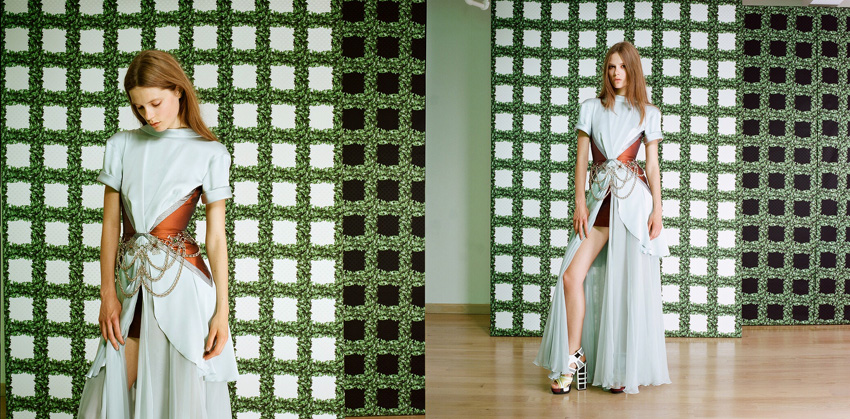
So Rodarte has just relaunched their website. And it is turning my bitter disappointment in their lacklustre collections into a great love. For years now the Rodartes (I know I know they are the Mulleavys, but ever since Grace Coddington referred to them as the Rodartes in The September Issue I can't call them anything else (remember the line? "Those poor Rodartes" - magic)). Woah, let's start that sentence again. For years the Rodartes have been taking beautiful fitting photos for each collection, but as far as I know they've been hidden until now. By having complete creative control of how their collections are presented, outside of the constraints of the runway show, the Rodartes are conveying their intentions far more effectively. I didn't like Fall 2013 or Spring 2012 at all, but thanks to these photos I am now understanding. It's like you are looking into the heads of Kate and Laura and seeing exactly what they see in their clothes.


I want to stress again just how disappointed I was with Spring 2012, the van Gogh one. No longer, these photos are like the phoenix rising through the ashes, disappointment and ambivalence burnt away.


I don't want to just show the collections I have only come to love now. The fitting photos for Spring 2013, the incredible fantasy role playing collection, are the ultimate, and it is a collection that I have always loved and will now love even more. Pseudo action poses lend themselves to ultra staged fittings well!


all images from rodarte.net go there!

2.2.12

Miu Miu S/S'12 (Hate to Love #3)

I must admit I was a bit grumpy at Miuccia Prada when she proudly announced that the Miu Miu Spring/Summer 2012 collection was designed and created in only 15 days. She said it like it was some great thing, however I wanted to yell (did yell, at my computer) "this isn't Project Runway people!". The statement bothered me because I felt like it cheapened the whole process of designing - it's not a race after all. There are already too many collections in a year and there is enough of a rush, enough of a focus on the 'new', without Prada stepping it up a notch.
Because of this I couldn't look at the collection without thinking about its rapid creation, and in a misinformed act of protest I just dismissed it. Only now, five months after the show was presented, has my head cleared and I can assess it without an angry bias. And with this distance, I have realised it is TOTALLY AWESOME.

I've cropped the images in this way deliberately because the hair, make-up and accessories, while maybe not being objectively ugly, certainly distract a huge amount from the clothes (please notice the diplomacy in my wording, it takes a lot of self-control).


I can pin the excellence of this collection down to a few distinct elements. The first is the upper body wrapping that featured throughout. They've been generally described as stoles, but they depart quite a bit from the traditional night-at-the-opera staple. Nevertheless, for whatever reason having your chest constricted is very elegant, as Ashley Olsen seems to have already figured out.
Another great element of the collection was the off-the-shoulder looks. To be honest they don't seem very practical, but they were what helped push this collection off-kilter for me, and that is always a good thing.


The a-line shape has been a bit of a trend for a while now, but Prada, in the way that only Prada can, completely transformed the silhouette by its own exaggeration, via not just skirts but cape-like coats too. And I have no idea how Prada chooses her colour palette for a collection, but I'd love to be a fly-on-the-wall for that process because none of the colours for this show made much sense, yet they all worked amazingly together. I can't help stealing the description of colours from Nicole Phelps: "oxblood, cherry red, cerulean blue".


The patchwork assembly of graphic textiles was also a stroke of inspiration paired against unlikely colours such as metallic lilac (look up). The women of the show were likened to "snarky" (thanks Cathy Horyn) Hitchcock-esque anti-heroines, but I think those interpretations were due solely to the twisted hair, makeup and shoes. When left alone the vaguely folk-ish collection of prints, along with the metallics and crazy shapes and details, speak more for themselves than for some hypothetical character.


Original images from vogue.com