Showing posts with label Spring/Summer 2012. Show all posts

2.2.12

Miu Miu S/S'12 (Hate to Love #3)

I must admit I was a bit grumpy at Miuccia Prada when she proudly announced that the Miu Miu Spring/Summer 2012 collection was designed and created in only 15 days. She said it like it was some great thing, however I wanted to yell (did yell, at my computer) "this isn't Project Runway people!". The statement bothered me because I felt like it cheapened the whole process of designing - it's not a race after all. There are already too many collections in a year and there is enough of a rush, enough of a focus on the 'new', without Prada stepping it up a notch.
Because of this I couldn't look at the collection without thinking about its rapid creation, and in a misinformed act of protest I just dismissed it. Only now, five months after the show was presented, has my head cleared and I can assess it without an angry bias. And with this distance, I have realised it is TOTALLY AWESOME.

I've cropped the images in this way deliberately because the hair, make-up and accessories, while maybe not being objectively ugly, certainly distract a huge amount from the clothes (please notice the diplomacy in my wording, it takes a lot of self-control).


I can pin the excellence of this collection down to a few distinct elements. The first is the upper body wrapping that featured throughout. They've been generally described as stoles, but they depart quite a bit from the traditional night-at-the-opera staple. Nevertheless, for whatever reason having your chest constricted is very elegant, as Ashley Olsen seems to have already figured out.
Another great element of the collection was the off-the-shoulder looks. To be honest they don't seem very practical, but they were what helped push this collection off-kilter for me, and that is always a good thing.


The a-line shape has been a bit of a trend for a while now, but Prada, in the way that only Prada can, completely transformed the silhouette by its own exaggeration, via not just skirts but cape-like coats too. And I have no idea how Prada chooses her colour palette for a collection, but I'd love to be a fly-on-the-wall for that process because none of the colours for this show made much sense, yet they all worked amazingly together. I can't help stealing the description of colours from Nicole Phelps: "oxblood, cherry red, cerulean blue".


The patchwork assembly of graphic textiles was also a stroke of inspiration paired against unlikely colours such as metallic lilac (look up). The women of the show were likened to "snarky" (thanks Cathy Horyn) Hitchcock-esque anti-heroines, but I think those interpretations were due solely to the twisted hair, makeup and shoes. When left alone the vaguely folk-ish collection of prints, along with the metallics and crazy shapes and details, speak more for themselves than for some hypothetical character.


Original images from vogue.com

2.11.11

Things That Were Disappointing

I'm getting the feeling that there's been a little too much... positivity around here lately. One wants to be careful with how much positiveness one dishes out, before you know it you could be happy about everything all the time and where is the fun in that? So here are the things of the SS'12 shows that were disappointing.


Rodarte


Please don't misunderstand me on this one. Rodarte wasn't bad, it was just disappointing. For an average designer, an average collection is good! But for amazing designers, an average collection is a huge disappointment. So that goes for every collection I talk about here - I just expected so much more.
In my post about Proenza Schouler I talked about how the collection was good because they interpreted their inspiration subtly and ingeniously. Here Rodarte, IMO, took their inspiration way too literally. Starry Night and Vase with Twelve Sunflowers printed on fifties prom dresses? Really? They could have done so much more with Van Gogh. I guess they did try to abstract things and just look at Van Gogh colours, but I think they just outright failed to find the right colours. And what did Nicole Phelps say? Something about gift stores and Starry Night mousepads. Mmmm verging a little too much on kitsch in a bad way.

One free pass, Rodarte, you have until AW'12...


Meadham Kirchoff


I was disappointed because it was too literal too? I guess that's a strange thing to say because Meadham Kirchoff's genius is taking more abstract ideas and making them literal. Maybe girlishness wasn't abstract enough this time around. Or you know what, maybe I JUST DIDN'T LIKE THE WAY IT LOOKED (you can see my Art History study and analytical skills are serving me well here)
I have to admit I like it a little bit more the more I look at it, but I still dub it a disappointment.


Marni


Ugh go away bright colour. You and your simplicity have no place at Marni.


Lanvin/Yves Saint Laurent


What is wrong with everyone?? Can't they see this is all really ugly?? WHAT THE HELL PEOPLE

Ok I've calmed down a bit. The problem with Lanvin is that all the models looked uncomfortable, and I would hazard a guess that the proportions in those clothes would make a normal person's body look terrible - they look terrible enough on the models. I know fashion isn't about always about beauty, but Lanvin has a responsibility in making women look good!
And Yves Saint Laurent could have been good, I wouldn't know because I just can't see past the colour combinations.

Totally hilarious anecdote: I was watching The September Issue with my mum, and when Stefano Pilati
comes on and Anna Wintour asks how he is and he's all "ehhh not that great actually, no?" (you don't do that outside of France man, outside of France you are "good thank you" at all times), my mum was all "I do not like this man he's whiny and a sycophant". So now whenever I see an Yves Saint Laurent collection all I can think is "a whiny sycophant created this" - kills it a little bit.

Hey but do you like how this post is not really that negative. It's actually kind of nice "I have too much faith in you designers"


photos from vogue.com

29.10.11

Paris SS'12 - Alexander McQueen

I was reading a review of the Alexander McQueen show a couple of days ago, and came across something like "In Sarah Burton's third outing at McQueen..." and I had to do a double take. Wait really? This is seriously only Burton's third show? I counted off on my fingers: pagan goddess; bondage in white; and this! Sea monsters/godesses! Time sure does move strangely. It feels like Burton's been at the helm forever but only this time last year she debuted. It's safe to say that she's defied everyone's expectations by carrying on so magnificently. You could argue that it has worked so well because Burton spent so long as McQueen's right hand (wo)man, but take just one look at how Bill Gaytten is doing at Dior and you know that that kind of background doesn't guarantee success.


Well once again this was one of those shows where the runway shots don't do it justice. What does do a little more justice are the detail shots, and what does a little more justice than that are the videos. Although I can't even imagine what it would be like witnessing it in the flesh. (But let's not weep over that, according to Cathy Horyn in the video below, it's ok that I don't get invited to shows!).
It matters a little more than usual not being able to see the clothes move though, because movement is what moved this collection into the extraordinary. When the models walked, the skirts looked like sea anemones undulating in the water. Like there was serious undulation going on. How on earth could you orchestrate that? Is Sarah Burton a scientist? Wut?? Every review mentions this, but heck it's with good reason: the ruffles were hand massaged. And I don't have the vocabulary yet to describe the construction of the clothes, but I will say this: I thought the beginning of this video was actually filmed underwater.


Diving for McQueen on Nowness.com.

And now I'm just going to go overboard and not exercise much editing control.


24.10.11

Milan SS'12 - Prada

Huzzuh Prada presented something fantastic this season! (I really didn't like those sequin scales six months ago) And this time around Miuccia Prada went for extra punch and made a feminist statement. Although not really a feminist statement, and it's all a little ambigous, especially considering what she said last year, that "there is no such thing" as a feminist. Ok, so it's a statement about women, and men, and the sexist way that men "own" cars and women, but it ain't feminism.

Hmmm.

You know what? A lot of feminist academics may not be, but I'm cool with that. I didn't even pick any of that up the first time I saw the collection, I was happily oblivious to all the subtext and could focus on the clothes. And that's what makes Prada so much better than everyone else isn't it? She often has lofty ideas and meaning behind her collections, but with none of that background knowledge the clothes can always speak for themselves too. (I guess this is why critics often liken her to an artist!)


A lot of critics described the collection as "sweet" and "feminine", but I didn't get that at all. Quite the opposite in fact, for all the pleated chiffon skirts and floral appliqués, these women were hard, tougher even than an Alexander Wang girl (who is really just a socialite pretending to be tough). All the pastels did was highlight how far from sweet the women and the clothes actually were.


That combination of bathing suits and heavy, glittering jewellry worked perfectly, and the suits even managed to make the models look shapely. And while I didn't like the literal interpretation of Van Gogh at Rodarte, I liked the literal interpretation of 50s cars here.


And like Proenza Schouler, such a focus on the mid-century and kitsch! Although those shoes are a hell of a lot tackier than anything that PS did. But of course, not tacky in a bad way - and Prada's often tacky, yet never badly so.

photos from vogue.com

19.10.11

London SS'12 - Acne and Burberry

Acne and Burberry are were both kind of confusing this time around. I love and hate them in equal measure because they were just... not quite right And not 'not quite right' in a kooky and interesting way but 'not quite right' because sometimes it just didn't work!

Acne's star cutouts were strange and I hated all the bagginess, and half the time the colour palette didn't mix well and that green is just gross. On the other hand, those shiny skirts were fantastic and the volume was great and the mustard was glorious and the layering was strangely good. It's also been getting a lot of press so I've been seeing it everywhere and I've been thinking about it quite a bit, and I still haven't made my mind up. So anyway, here is, in my opinion, the good and the bad.

The Good


The Bad


I at first laughed at those pom pom hats at Burberry, and then deigned them kind of cute but still hilarious, and these pom poms are basically a metaphor for the entire collection. Not that the rest of it is equally cute and hilarious, just that it's a real mix of good and bad.
I've found that looking at individual looks, I've really enjoyed them. The arts and crafts details are sweet and just that much different from all the futurism we've been seeing - although it's also very easy for the general 'ethnic' touches in detailing and prints to become cringeworthy, steering into cultural appropriation territory. (oh god, remember like, 5 years ago when everything was boho and all Africa everything?). The purples, ochres and pinks made up a palette much earthier than most other shows we've been seeing, and the prints had a lot of graphic impact instead of coming out a jumble (in contrast to a few shows I can think of...).
But then when you look at it as a whole, those colours become a bit boring, and it all seems a little soulless and homogenized - especially when considering the generic 'ethnic' details (was the influence Nigeria? Nepal?).
Once again, I am undecided. I'll just include those individual looks which work.


Ooooo I just noticed they both have those high volume, crinkly cotton skirts. Maybe Christopher Bailey and Jonny Johansson both decided to throw us a crazy-coloured, strange-volumed curve ball to see how the world would react.

(Note: just read the style.com review for Acne, turns out Johansson was inspired by Morocco! At least he didn't have ethnic cliches in his collection)

photos from vogue.com

17.10.11

London SS'12 - Erdem

Erdem's never ground breaking, in my opinion, but sometimes it's really nice to just have some beautiful, relatively simple and cohesive clothes to look at. And Erdem's so totally English that I have to include him in my favourite London shows.


Usually I find Erdem's collections to be a little too sweet, and then last season he did a 360 and I found all the moody blues and magentas way too heavy, too dense, as if he were trying to prove that he is more than just pretty. Well this season I think he achieved what he was aiming for last season, which is providing pretty with more guts and weight - and instead of having to go dark, he went absolutely light.


It seems a little too cliched to describe a Spring floral collections as fresh, but that's exactly what it was! Wonderfully fresh, a breath of fresh air. And that blue, that blue was a revelation. It was so crisp and paired with the orange-red lips the whole effect was like a splash of cold water on your face. And the fact that it ran throughout almost the entire show unified the collection and made it very satisfying to consider as a whole.


Prim and proper flowers always bring to mind London of course, and this season Erdem seemed particularly proud of his English-ness. Each and every dress was worthy of a morning tea or Anglican christening. And the little hats and gloves - so perfectly matched.


That is not to say that he clothes are stodgy or cloying. Sarah Mower articulately describes how he managed to provide garden party dresses filled with "cornflowers and delphiniums, primroses and marigolds" without everything becoming too precious or fussy: "he's a maximalist born with an affection for the pure and simple".
Yes, that certainly sums it all up perfectly.


(I just realised that this really parallels Christopher Kane's show - dark florals = bad, light florals = good) (also, Christopher Kane was my favourite show of London, but I've already blogged about that) (oh and also, spaghetti straps again!)

photos from vogue.com

12.10.11

New York SS'12 - Marc Jacobs

The other great collection out of New York was Marc Jacobs, who always puts on a good show but not necessarily one that I like (case in point: last season). You can't see this in most coverage, but it started with a gold curtain revealing the models on a spotlit stage, posed in a jazz-dancehall style scene like something out of All That Jazz; I'm sure the kind of thing that would give you shivers of excitement if you were lucky enough to be in the audience.


Hamish Bowles (of Vogue) wrote in his review "this was not another playful twist on period dressing", referencing the 1970s extravaganza of last Spring, because although there were 1920s-dropped waists and headscarves and gingham and sassy attitudes, there wasn't the same costume element. Extended from the flapper look, a new silhouette emerged out of the tight tops pulled low over equally narrow , long skirts. And with all the cellophane wrapping and shimmering ruffles and gingham it was definitely forward, rather that backward looking.


Over at style.com, Nicole Phelps thought the whole thing "fell a little bit flat" and that the set was more exciting than the clothes. Hmmm. Sure, at first I wasn't at all impressed with the clothes , but I think that the styling was responsible for obscuring some of the individual pieces. The show wasn't styled for consumers to lust over, but I think this sacrifice resulted in, overall, one heck of a show. Maybe part of the reason Phelps didn't like it is that there is definitely something off about it, something totally unusual - which has kept me thinking about it for days.


Finally, let's hand it to those headscarves:


First photo from models.com
Runway photos from vogue.com

1.10.11

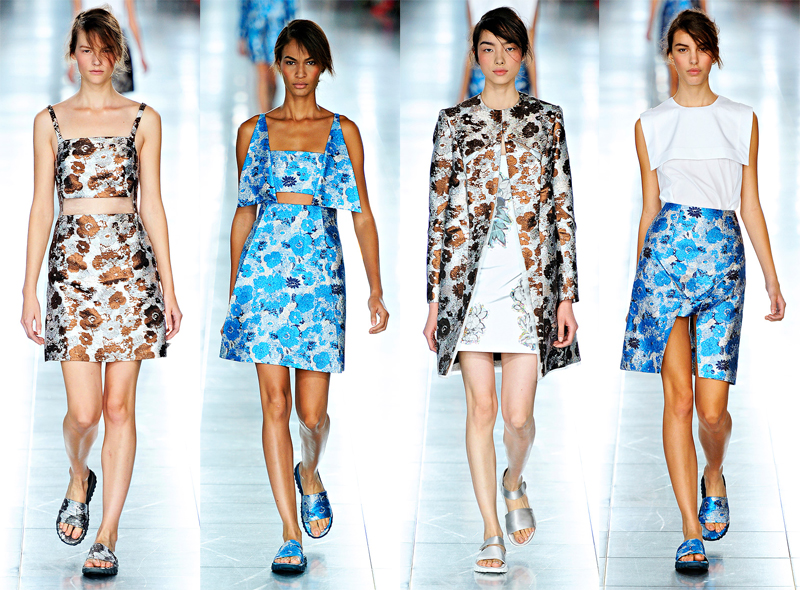
Christopher Kane S/S 2012

I've always had a soft spot for Christopher Kane, and out of all the London shows he's who I look forward to most. Unfortunately I build him up in my head each year and am always a little bit disappointed (life lesson: expect the worst in everything and you'll be happily surprised a lot of the time). He hasn't really lived up to my personal hype since S/S 2010 (Lolita in gingham), and I initially had that same disappointment this time around.
But then I was reading a review from fashionista.com which said that the photos didn't do the collection justice at all. This is often the case, so when the photos aren't great you need to watch a video of the show, and luckily models.com already have a one up! It's only one minute long but that's enough, finally you can see the lightness and luminescence that all the reviews were going on about.


And you know what? After watching the video, the photos improve too! Because you now understand them - instead of the first few looks just seeming washed out now it's all HOW ABOUT THOSE METALLICS:


and HOW ABOUT THOSE FLORAL METALLICS:


I also like how the other florals are like the reverse of his embroided-leather florals from a few seasons back. One look is totally light, the other is totally dark.


And then everything enters another level with the insane beading. I mean it almost rivals the beading in that Chanel Couture show and Kane is just some London newbie! (Relative term, of course)


Hmmm in the photos the footwear kinda looks like Zuckerberg-y Adidas sandals, but really they're fantastic. They are very wrong and very right at the same time, which also goes for that one pair of jeans thrown in (so random).


This is a prime example of why you shouldn't necessarily report on shows right away! (although I understand style.com that you need to get them out quickly) Had I given you my initial thoughts it would have all been "bleugh' and "meh". And now I'm back to over-hyping Kane's next collections.

                                                                                    all photos from vogue.com