31.10.11

Areez Katki

Areez Katki is a designer from New Zealand who knits unique pieces from wool and, geez anything that you can knit basically. Off the top of my head some of the stranger materials he's used include something to do with nettles and bungy-cord. Usually he creates pieces that verge on wearable objects, but this season he made a collection more like ready-to-wear. But he hasn't compromised at all by making things wearable and this is my favourite work of his by a landslide - the combination of that orange-red, black, cream and blue is so clean, the colours seem to vibrate against each other.
Photography by Oliver Rose

29.10.11

Paris SS'12 - Alexander McQueen

I was reading a review of the Alexander McQueen show a couple of days ago, and came across something like "In Sarah Burton's third outing at McQueen..." and I had to do a double take. Wait really? This is seriously only Burton's third show? I counted off on my fingers: pagan goddess; bondage in white; and this! Sea monsters/godesses! Time sure does move strangely. It feels like Burton's been at the helm forever but only this time last year she debuted. It's safe to say that she's defied everyone's expectations by carrying on so magnificently. You could argue that it has worked so well because Burton spent so long as McQueen's right hand (wo)man, but take just one look at how Bill Gaytten is doing at Dior and you know that that kind of background doesn't guarantee success.


Well once again this was one of those shows where the runway shots don't do it justice. What does do a little more justice are the detail shots, and what does a little more justice than that are the videos. Although I can't even imagine what it would be like witnessing it in the flesh. (But let's not weep over that, according to Cathy Horyn in the video below, it's ok that I don't get invited to shows!).
It matters a little more than usual not being able to see the clothes move though, because movement is what moved this collection into the extraordinary. When the models walked, the skirts looked like sea anemones undulating in the water. Like there was serious undulation going on. How on earth could you orchestrate that? Is Sarah Burton a scientist? Wut?? Every review mentions this, but heck it's with good reason: the ruffles were hand massaged. And I don't have the vocabulary yet to describe the construction of the clothes, but I will say this: I thought the beginning of this video was actually filmed underwater.


Diving for McQueen on Nowness.com.

And now I'm just going to go overboard and not exercise much editing control.


26.10.11

Milan Substitute

I really wanted to post another Milan show, but there just wasn't anything good enough (yes my standards are that high). Jil Sander was... interesting but I thought the whole thing was a little early 90s in a very bad, boxy, raw silk kind of way. I'm not even sure if raw silk was used but it had that feeling - take look at the detail shots, I mistook a couple for circa-1989 Lagerfeld Chanel.


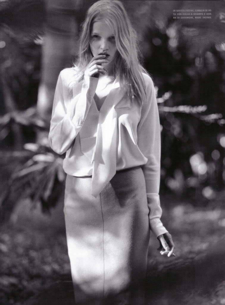
But I don't want to deprive you good people of Italian sass, so as a substitute here is one of my favourite Bruce Weber shoots with one of my favourite models, Lara Stone, for Italian Vogue.
I've edited some of the raunchier images because well I'M A PRUDE THAT WAY. No it's really because I don't think a three-way with a sleazy old man sends the right messages.


How does she manage to make a pencil skirt and black cardigan not look like a secretary's outfit?

24.10.11

Milan SS'12 - Prada

Huzzuh Prada presented something fantastic this season! (I really didn't like those sequin scales six months ago) And this time around Miuccia Prada went for extra punch and made a feminist statement. Although not really a feminist statement, and it's all a little ambigous, especially considering what she said last year, that "there is no such thing" as a feminist. Ok, so it's a statement about women, and men, and the sexist way that men "own" cars and women, but it ain't feminism.

Hmmm.

You know what? A lot of feminist academics may not be, but I'm cool with that. I didn't even pick any of that up the first time I saw the collection, I was happily oblivious to all the subtext and could focus on the clothes. And that's what makes Prada so much better than everyone else isn't it? She often has lofty ideas and meaning behind her collections, but with none of that background knowledge the clothes can always speak for themselves too. (I guess this is why critics often liken her to an artist!)


A lot of critics described the collection as "sweet" and "feminine", but I didn't get that at all. Quite the opposite in fact, for all the pleated chiffon skirts and floral appliqués, these women were hard, tougher even than an Alexander Wang girl (who is really just a socialite pretending to be tough). All the pastels did was highlight how far from sweet the women and the clothes actually were.


That combination of bathing suits and heavy, glittering jewellry worked perfectly, and the suits even managed to make the models look shapely. And while I didn't like the literal interpretation of Van Gogh at Rodarte, I liked the literal interpretation of 50s cars here.


And like Proenza Schouler, such a focus on the mid-century and kitsch! Although those shoes are a hell of a lot tackier than anything that PS did. But of course, not tacky in a bad way - and Prada's often tacky, yet never badly so.

photos from vogue.com

21.10.11

Art and Fashion #2

A couple of years ago I got a CD of Lied (which is the word for German individual operatic songs (ooo fancy)) as a Christmas or birthday present, and on the cover was this painting:


Usually classical music CD covers are incredibly tacky, so it was a nice change to have something other than air-brushed lady musicians in strapless evening gowns clutching a violin or sheet music like some awkward, sexy prop. Not only that but the painting is totally kick-ass.
It was painted by Ferdinand Hodler, who was this Swiss guy painting around the late 19th/early 20th centuries, and most of his work, along with this piece, is really similar to Gustav Klimt and Egon Schiele in subject and style. And what I initially loved about this painting is boy does this woman look capable. Not only that but quite sublimely calm. It's called Lied aus der Ferne which I think means "Mountain Song", so it's like she is about to burst into song, with the hills as her audience.


But more important is that amazing blue dress. I looked into other works by Ferdinand Hodler, and the blue dress seems to be something of a motif. I don't know what it symbolises or means, but I do know that they are incredibly beautiful in their simplicity and have an almost utalitarian feeling.


So what I've been wondering is, was there just one woman in his life who had this dress? The more I look at his paintings the more it seems he is repeating the same dress over and over, like he has one model with just one outfit. And why did he pick this dress? Is there a spiritual meaning? There is so much intrigue! I want answers dammit.


19.10.11

London SS'12 - Acne and Burberry

Acne and Burberry are were both kind of confusing this time around. I love and hate them in equal measure because they were just... not quite right And not 'not quite right' in a kooky and interesting way but 'not quite right' because sometimes it just didn't work!

Acne's star cutouts were strange and I hated all the bagginess, and half the time the colour palette didn't mix well and that green is just gross. On the other hand, those shiny skirts were fantastic and the volume was great and the mustard was glorious and the layering was strangely good. It's also been getting a lot of press so I've been seeing it everywhere and I've been thinking about it quite a bit, and I still haven't made my mind up. So anyway, here is, in my opinion, the good and the bad.

The Good


The Bad


I at first laughed at those pom pom hats at Burberry, and then deigned them kind of cute but still hilarious, and these pom poms are basically a metaphor for the entire collection. Not that the rest of it is equally cute and hilarious, just that it's a real mix of good and bad.
I've found that looking at individual looks, I've really enjoyed them. The arts and crafts details are sweet and just that much different from all the futurism we've been seeing - although it's also very easy for the general 'ethnic' touches in detailing and prints to become cringeworthy, steering into cultural appropriation territory. (oh god, remember like, 5 years ago when everything was boho and all Africa everything?). The purples, ochres and pinks made up a palette much earthier than most other shows we've been seeing, and the prints had a lot of graphic impact instead of coming out a jumble (in contrast to a few shows I can think of...).
But then when you look at it as a whole, those colours become a bit boring, and it all seems a little soulless and homogenized - especially when considering the generic 'ethnic' details (was the influence Nigeria? Nepal?).
Once again, I am undecided. I'll just include those individual looks which work.


Ooooo I just noticed they both have those high volume, crinkly cotton skirts. Maybe Christopher Bailey and Jonny Johansson both decided to throw us a crazy-coloured, strange-volumed curve ball to see how the world would react.

(Note: just read the style.com review for Acne, turns out Johansson was inspired by Morocco! At least he didn't have ethnic cliches in his collection)

photos from vogue.com

17.10.11

London SS'12 - Erdem

Erdem's never ground breaking, in my opinion, but sometimes it's really nice to just have some beautiful, relatively simple and cohesive clothes to look at. And Erdem's so totally English that I have to include him in my favourite London shows.


Usually I find Erdem's collections to be a little too sweet, and then last season he did a 360 and I found all the moody blues and magentas way too heavy, too dense, as if he were trying to prove that he is more than just pretty. Well this season I think he achieved what he was aiming for last season, which is providing pretty with more guts and weight - and instead of having to go dark, he went absolutely light.


It seems a little too cliched to describe a Spring floral collections as fresh, but that's exactly what it was! Wonderfully fresh, a breath of fresh air. And that blue, that blue was a revelation. It was so crisp and paired with the orange-red lips the whole effect was like a splash of cold water on your face. And the fact that it ran throughout almost the entire show unified the collection and made it very satisfying to consider as a whole.


Prim and proper flowers always bring to mind London of course, and this season Erdem seemed particularly proud of his English-ness. Each and every dress was worthy of a morning tea or Anglican christening. And the little hats and gloves - so perfectly matched.


That is not to say that he clothes are stodgy or cloying. Sarah Mower articulately describes how he managed to provide garden party dresses filled with "cornflowers and delphiniums, primroses and marigolds" without everything becoming too precious or fussy: "he's a maximalist born with an affection for the pure and simple".
Yes, that certainly sums it all up perfectly.


(I just realised that this really parallels Christopher Kane's show - dark florals = bad, light florals = good) (also, Christopher Kane was my favourite show of London, but I've already blogged about that) (oh and also, spaghetti straps again!)

photos from vogue.com