
Only ever seeing collections from a computer screen means you can forget about the finer points that makes clothes what they are. Things like movement and the fact that they exist in three-dimensions rather than the two that LED lit pixels afford us. What was it that Grace Coddington said? "On a flat screen, things look flat". The closest us regular folk can get to the real thing are the videos. But in both video and still image, you can still forget about the details. And in cases like the latest, personally disappointing Rodarte show, the clothes actually look better close up than from afar. If I hadn't stumbled across these over at the Self Service website I would not have known the subtler beauty of the collection that consisted of textural contrasts between silk and cotton, tonal contrasts between black and navy, and tiny barbed wire fastenings.


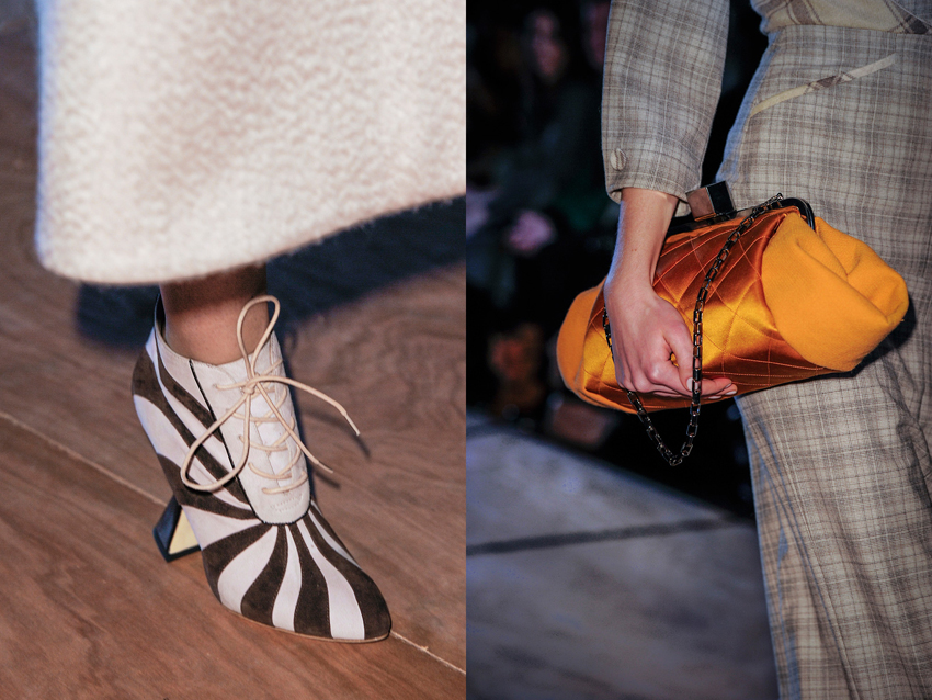
Prompted by Rodarte I've been making a point to look through all the detail shots of every collection, especially ones I'm on the fence for. Unfortunately the lighting at Roksanda Ilincic was bad, or the photographer seems to have used a far too powerful flash, because in the regular runway images the clothes are super washed out. But hurrah for the detail shots, because here the true hues shine through, as does the luscious detailing.


Prompted by Rodarte I've been making a point to look through all the detail shots of every collection, especially ones I'm on the fence for. Unfortunately the lighting at Roksanda Ilincic was bad, or the photographer seems to have used a far too powerful flash, because in the regular runway images the clothes are super washed out. But hurrah for the detail shots, because here the true hues shine through, as does the luscious detailing.
images from Self Service and Vogue.com


