28.4.12

Art and Fashion #4

This one could definitely be filed under 'philosophy and fashion' or 'architecture and fashion' too. Grace Coddington sure loves her editorials steeped in art history, and this one is a bonanza of references. Constructivism, Bauhaus, Cubism, and most of all it seems Futurism - especially since it mentioned "a dash of 1920s utopia".
It is a well known fact for those who know me personally that I really, really don't like Futurism. I dislike this movement so much, a movement carried out by sinister Italian men in the 1920s and focused on machines and movement and, yes, the future, that on a recent trip to the Tate I went out of my way to specifically pose for photos with unimpressed facial expressions beside Boccioni's walking Man Sculpture. I do, however, like Le Corbusier, even though his 1920s utopian plans for the future failed miserably - which is worse than them not ever coming to fruition at all. Since I've brought it up, before we look at the Vogue spread, let's have a wee look at Corbusier-esque "utopias", shall we?

Le Corbusier's original dream, Plan Voisin. Terrifying. 


Failure Number One: Unite d'Habitation
Lowdown: Orignially created by Corbusier as an apartment-block community for those left homeless after WWII. Cost too much to build so apartments ended up being sold to yuppies.


Failure Number Two: Pruitt-Igoe
Lowdown: 1950s urban housing development from St Louis, Missouri in the spirit of Le Courbusier's utopian communities. Turned into a slum and was demolished by the 70s (watch this documentary about it!)


Failure Number Three: Cabrini Green
Lowdown: Basically a Chicago version of Pruitt-Igoe. A poster child for a specific strain of American woe. The last building in the complex was demolished only last year!


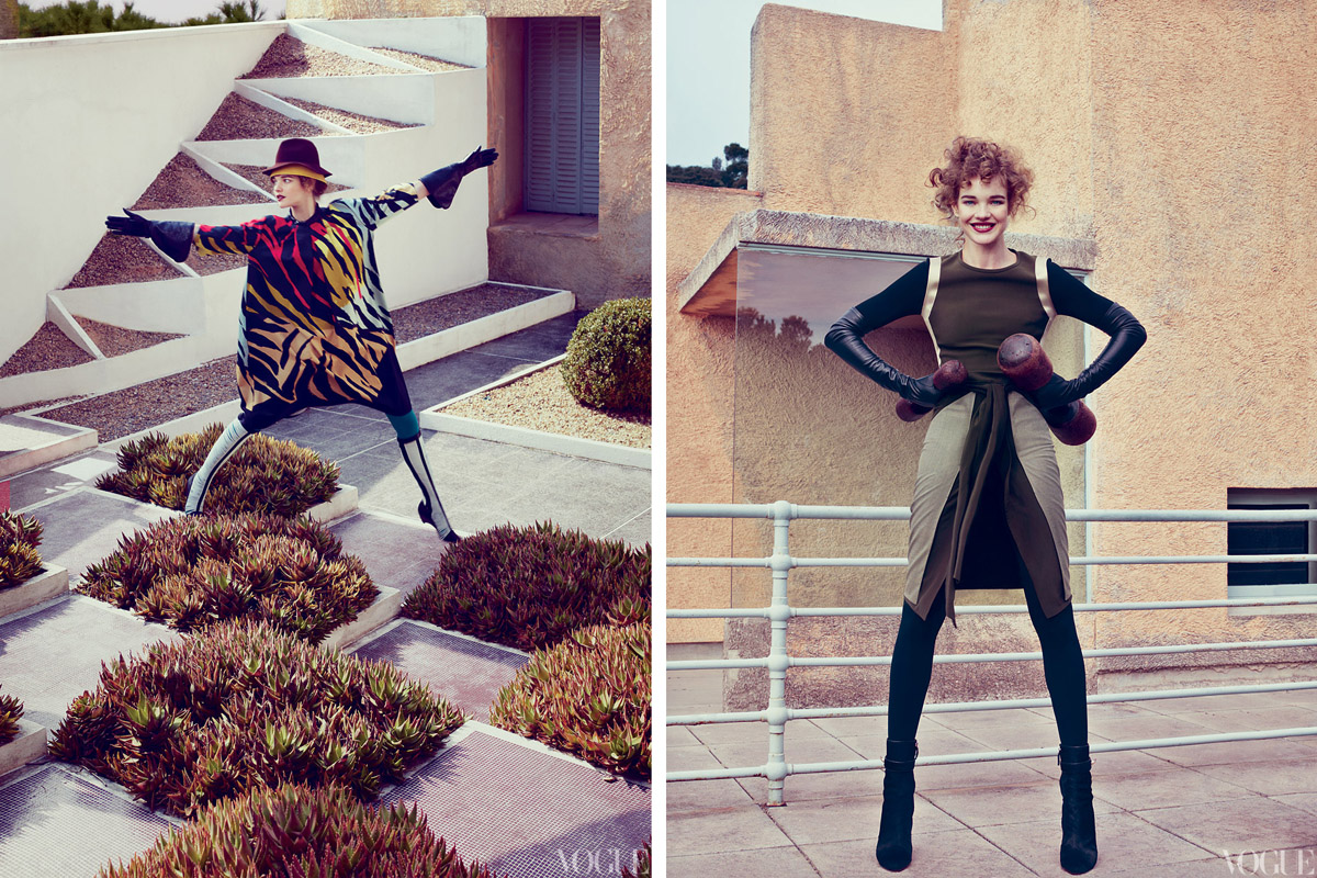
Of course the architecture we're looking at in this editorial is closer to Bauhaus than to these Corbusier-esque housing complexes, but Vogue mentioned "1920s Utopias", not me. And there are also plenty of high-brow references to things such as Constructivism and Picasso and Cocteau. And the result of all of this? Well it's kind of creepy and off to be honest - but there's something so non-Vogue and generally wrong about it all that I really like it. I loved the colours, have a love/hate relationship with the architecture, thought the clothes were somewhat bad but it all works out. Fassbender doesn't hurt either of course.


Editorial images from vogue.com

15.4.12

Close Up

If there's one thing that Sergio Leone does well, that'd be close ups. And what marvellous close-ups he did. I was originally digging around for screencaps of cowboy clothes, but I came across these gems from Once Upon a Time in the West instead. See the sweat. Feel the intensity. Tremble at their gaze.

On a side note also admire their hats.


14.4.12

Dries vs Zombies

I had a dream about Dries van Noten last night. It was the zombie apocalypse - a group of us had dashed to a train station to avoid the undead horde and, whilst we were hiding in an empty freight, who should wander by but Mr van Noten himself. He was as cool as a cucumber, hands in pockets, whistling and paying no attention to the hungry zombies. In fact his mere presence seemed to drive them off. He was our savior.


"I got this"


This dream says more about what van Noten means to me than about van Noten himself. Apparently my subconscious thinks Dries van Noten is a hero akin to motherfukin Aragorn with powers that lie beyond, and are entirely due to, his design skills. And you know what? I'm going to consciously stand by my sub-conscious because Winter 2012 was awesome (you can tell I'm going to be a writer with this vocabulary).


It started with those blues. The navy. The cobalt. The powder. I think I can now visualise the colours of heaven. If I were a proper reviewer, for a proper publication, I would say something like "the striking blues that opened the show revealed supreme confidence from van Noten - here is a designer in his prime". But uh, I'm not so I'm going to have to leave that sort of snappy writing to the pros.

You can see in these first three looks, and it ran throughout the rest of the collection, that there was this beautiful light sense of movement and fluidity. It made me think of all those sassy ladies leaping and fighting in Crouching Tiger, Hidden Dragon and House of Flying Daggers (the costume design in these movies is amazing). And this of course ties in with the main story for this collection - that van Noten visited the Victoria and Albert Museum and checked out Chinese, Korean and Japanese textiles. He loved them so much he reproduced them and printed 'em straight on the clothes! I hated the cityscape prints of last season, but these prints are just gorgeous. Everything is telling me that you should not cut up and block such complicated textiles, but van Noten has worked magic here. And that gold embroidery... just... ugh... I have no words.


And van Noten is well known for having a penchant for khaki and utilitarian elements which straddle that fine line between taste and tackiness and, as always, emerge gloriously triumphant. I've spent the last week scouring second-hand shops for fur-hooded jackets with some relation to these (as can be expected, no dice). And of course when van Noten does evening, he really goes for it. It's all gold and sleek and shiny and so formidable that I can't imagine anyone pulling any of it off except for perhaps Isabella Rossellini.


runway images from vogue.com

11.4.12

Tumblr Architecture

I really don't do tumblr. I don't have anything against it, it just doesn't seem very... interesting? Words are good ok, I like words. And it kinda bugs me that the images are rarely attributed to anyone, it's just one big throw-up of people and things and places and in the anonymous mass meaning is completely lost. Yet, having said that, there is one tumblr that I do visit, one only, and that is il cinema lunare (translates to... "moon movies"? I don't speak Italian I have no idea). Key to this tumblr's appeal are the architecture and interiors photographs - in this case I like the anonymity, all the places seem remote, private and utterly peaceful. So here I have culled my favourites.


6.4.12

Nice Work

Fashion Gone Rogue has been on a good run lately, I think all of these editorials are exceptional, the kind of editorials I would buy a whole crappy magazine for. And I live in New Zealand so magazines are expensive! I'm talking $25(NZD) for a new Vogue!

I especially love the Liu Wen shoot though. The frontality and framing is so unusual yet works so well.


4.4.12

'Ethnic' Fashion and Rodarte

Semester started and for a while I swear I didn't think about this blog for like three weeks. It's not like there were heaps of assignments or stuff - I'm not doing law people! But I don't think I'm one of those adaptable go getter types and so when there is change in my routine I go into shock for a while. But I'm out! Here I am! I was meaning to post about the Dries van Noten show but I'm glad I put it off because something relevant popped up in fashion news, and that is the criticism by Megan Davis, a UN expert on indigenous issues and herself an indigenous Australian, of the use of Aborigine art in the latest Rodarte collection.


I would like to make this clear: I AM NOT AN EXPERT ON INDIGENOUS ISSUES, I AM NOT A GOOD DEBATER AND I LIKE TO AVOID CONFLICT SO I WILL NOT BE SPECULATING AS TO WHETHER/WHAT DEGREE THE RODARTE COLLECTION WAS INSENSITIVE. Instead I am taking the opportunity to look at the issue of "ethnic" inspiration in "western" fashion collections (I am putting these words in inverted commas because I am thinking about a lecturer of mine who would get super mad whenever anyone used a huge generalization like "Western" - well guess what, I'm not getting marked on this so I'll generalize all I want!).

It is interesting that of all the borrowing on non-western (there I go again) design codes recently - Proenza Schouler's martial arts collection and Pre-fall Chanel's trip to India to name just two - Rodarte's case was the one singled out. But I think perhaps one reason for this is it is so rare for Aborigine culture to be referenced in mainstream design. Those poor Japanese and Chinese get hacked ALL THE TIME. I mean consistently since the mid 1800s have artists and designers been plundering their culture. And back when Toulouse-Lautrec was riffing on woodblocks there were no blogs for Japanese academics to get indignant about the fact that everyone was praising these ca-razy new art forms, when really they were just a poor man's woodblock print. But as for Aborigine art to be reproduced on expensive dresses, well this is new - and as well as that, they are certainly more on the back-foot internationally and locally than say Japan.


One commenter on fashionista.com pointed out that to define some cultures as more vulnerable than others is somewhat condescending, which is true, yet it is impossible to ignore the fact that Aborigine culture has suffered and been beaten down significantly more than most other cultures that are appropriated for the sake of fashion. The closest parallels that come to my mind are the use of Native American art and design in fashion design - or I'm sorry, Navajo design (that was sarcasm btw, in case you are thinking I'm a total idiot). While there's been criticism (and lawsuits) over brands using the word 'navajo' to describe their products, interestingly there hasn't been Rodarte-level of outrage over collections like Proenza Schouler's Fall 2011 ode to the rug.


This issue is all pretty complicated, and I don't know what I think about it all. But the point is it's worth thinking about. So I was going to relate this back to Dries van Noten's collection, which looked to Chinese, Japanese and Korean textiles for inspiration. Actually no, I shouldn't say inspiration, the textiles were really just reproduced. But this post is already too big as it is, in my opinion, and I would like to devote a whole post to this Dries van Noten collection alone because I love it so much. That'll have to wait until tomorrow. Or the next day!


Runway images from vogue.com