Showing posts with label Proenza Schouler. Show all posts

11.4.13

Proenza and Schouler and Divola and Dance, Together

Boy, they sure ain't kidding when they say fashion moves fast. Not a month since New York Fashion Week this Document Journal editorial springs up, influenced by Proenza Schouler's F/W2013 Collection. To be precise it's not exactly influenced by the collection, but by Jack and Lazaro's own influence for the collection (which is somewhat dubiously related to the resulting clothes), photographer John Divola's Zuma series.


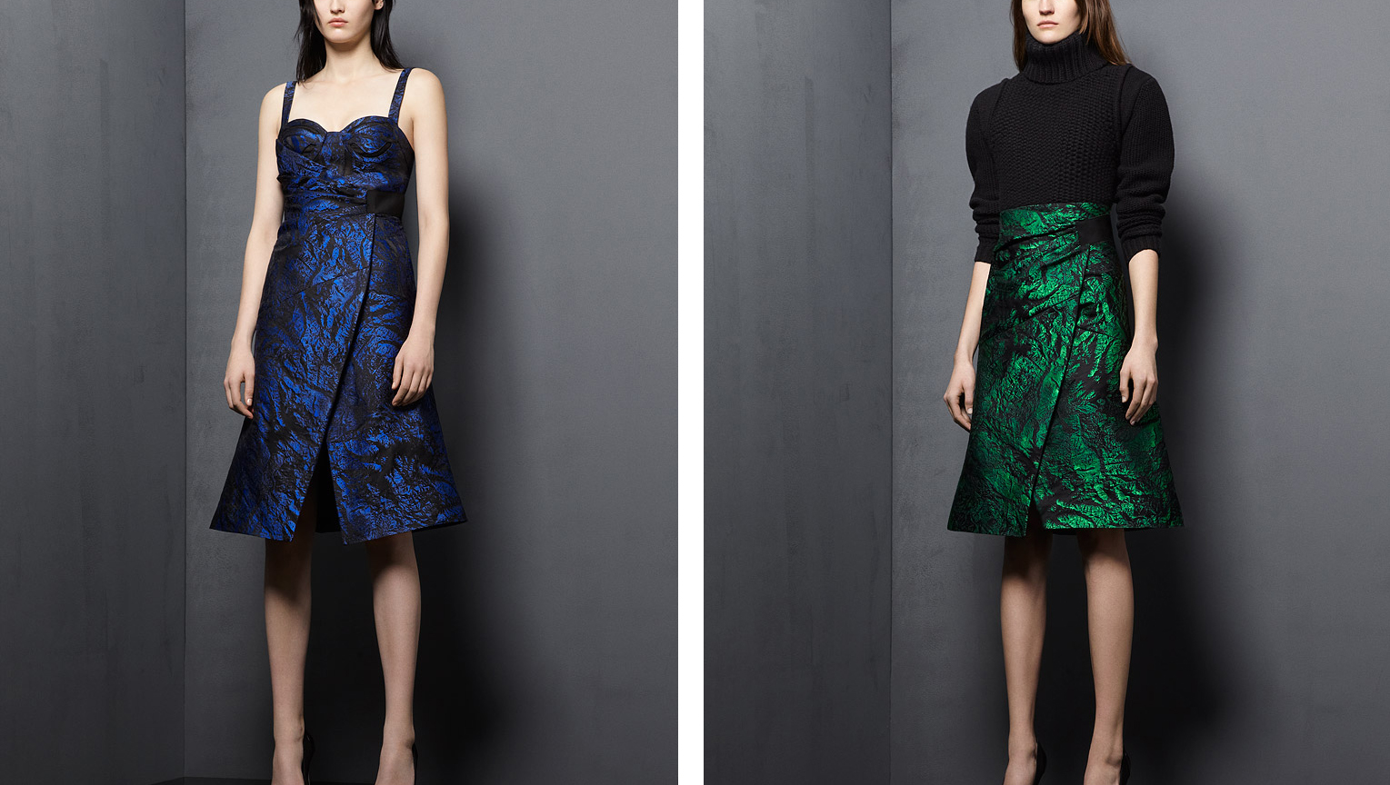
The menacing mood, surreal lighting, and the state of disrepair of the location have all been toned down for the editorial, but a sanitized spirit of Divola's California-in-decay still remains. In the hands of a lesser stylist the concept could have seemed derivative or gimmicky, but as usual stylist Stevie Dance manages to capture - or create - the spirit of the times while producing something that looks and feels completely unique. Dance is exceptional for her ability to make high fashion look, if not "street" exactly, less like the wardrobes of bankers'-wives and more creatively and culturally relevant - as well as oddly wearable.

Unlike those editorials which literally re-present entire looks from a collection, in the exact same spirit and narrative of their show, Dance reinvents the context and attitude of clothes so that it's harder to pinpoint which designer or collection a look comes from. Essentially Dance has unusually great creative influence for a stylist, she influences how an audience interprets clothes rather than merely offering them up for view.

But back to Divola, better not forget Zuma itself:


But referencing the Zuma series is all pretty controversial at the moment. Divola himself is a little miffed by the extent to which his work keeps "inspiring" shoots like these. Before the Zuma series was an influence for Jack and Lazaro's Winter 2013 Collection, it was directly riffed off for the Spring 2013 Campaign. So this editorial is a little stupid on Document Journal's behalf - or not of course, they could have already known about the controversy, and any press is good press yadda yadda.


Document Journal editorial from Fashion Gone Rogue
John Divola images from his website
Proenza Schouler campaign from the depths of the web

23.3.13

Octo Style/NY-JPN

This is a post about the highlights of New York's Winter 2013 fashion week, but I'm going to backtrack a bit to Pre-Fall 2013 to set the scene. Lately at The Row, Mary-Kate and Ashley have been veering occasionally from neu-conservatism elegance into regular old octogenarian elegance. Some of these looks remind me of the final page of all those Vogue "style at any age" features. And there is nothing wrong with advanced style, but rather than the theme of radical restraint of previous The Row collections, on twenty-somethings these clothes seem stale and conservative.


So with Pre-Fall 2013 as a precursor, it was with extra interest and slight apprehension that I took in F/W 2013. In some ways the octo-style theme was continued, with subtly textured creamy gold adorning practical pants and opera-ready shawls. Literally both my grandmas had pants like that.


But in many more ways my fears that The Row had crossed the line for good, from radically conservative to conservative-conservative, were assuaged. They've taken their usual Japanese motifs to new and glorious heights, their all-navy looks wrapped by pseudo-obis, coats nipped and flaring to perfectly shape the body, or tied at the sides, and everything always in a glorious symphony of textures. Of course every designer and his dog has been feeling Japanese lately, but when it comes to the cut and unusual shapes and silhouettes, Mary-Kate and Ashley are more meticulous, more focused, and simply better.


MK and Ashley explained the collection as a mix of Victorian and Japanese dress codes, and while the Victorian element can certainly be found in the modesty of these looks, the combination was even clearer in their set design. The location was an Upper East Side townhouse, and it was decorated in a hushed-elegance sort of way with carefully mismatched antiques and Japanese floral arrangements.


And if grand themes were to be found at New York Fashion Week, an understated and very serious interpretation of elements of Japanese dress was one of them. Proenza Schouler also riffed on the obi, and the folding and wrapping of Japanese dress. The looks which utilized these elements were some of the best, and emphasized the controlled movement of the clothes, a theme that ran through the whole collection. Even the gentle curves of jacket and skirt edges were completely controlled, and moved in a kind of erratic way rather than fluidly.


Many reviews noted that this comparatively sober show was very "grown up" for Proenza Schouler, but I thought the surprised tone was unfounded. Sure Proenza Schouler is synonymous with the young, thin It Girls, but they have always shown collections with undercurrents of the prim and proper, from Spring '09 to Spring '12. Maybe I just hate this particular cliche, but if anyone else claims that Jack and Lazaro have "grown up" I'm gonna get real mad.


The Row images from vogue.com
Interior image from Habitually Chic
Proenza Schouler images from vogue.com and models.com

4.4.12

'Ethnic' Fashion and Rodarte

Semester started and for a while I swear I didn't think about this blog for like three weeks. It's not like there were heaps of assignments or stuff - I'm not doing law people! But I don't think I'm one of those adaptable go getter types and so when there is change in my routine I go into shock for a while. But I'm out! Here I am! I was meaning to post about the Dries van Noten show but I'm glad I put it off because something relevant popped up in fashion news, and that is the criticism by Megan Davis, a UN expert on indigenous issues and herself an indigenous Australian, of the use of Aborigine art in the latest Rodarte collection.


I would like to make this clear: I AM NOT AN EXPERT ON INDIGENOUS ISSUES, I AM NOT A GOOD DEBATER AND I LIKE TO AVOID CONFLICT SO I WILL NOT BE SPECULATING AS TO WHETHER/WHAT DEGREE THE RODARTE COLLECTION WAS INSENSITIVE. Instead I am taking the opportunity to look at the issue of "ethnic" inspiration in "western" fashion collections (I am putting these words in inverted commas because I am thinking about a lecturer of mine who would get super mad whenever anyone used a huge generalization like "Western" - well guess what, I'm not getting marked on this so I'll generalize all I want!).

It is interesting that of all the borrowing on non-western (there I go again) design codes recently - Proenza Schouler's martial arts collection and Pre-fall Chanel's trip to India to name just two - Rodarte's case was the one singled out. But I think perhaps one reason for this is it is so rare for Aborigine culture to be referenced in mainstream design. Those poor Japanese and Chinese get hacked ALL THE TIME. I mean consistently since the mid 1800s have artists and designers been plundering their culture. And back when Toulouse-Lautrec was riffing on woodblocks there were no blogs for Japanese academics to get indignant about the fact that everyone was praising these ca-razy new art forms, when really they were just a poor man's woodblock print. But as for Aborigine art to be reproduced on expensive dresses, well this is new - and as well as that, they are certainly more on the back-foot internationally and locally than say Japan.


One commenter on fashionista.com pointed out that to define some cultures as more vulnerable than others is somewhat condescending, which is true, yet it is impossible to ignore the fact that Aborigine culture has suffered and been beaten down significantly more than most other cultures that are appropriated for the sake of fashion. The closest parallels that come to my mind are the use of Native American art and design in fashion design - or I'm sorry, Navajo design (that was sarcasm btw, in case you are thinking I'm a total idiot). While there's been criticism (and lawsuits) over brands using the word 'navajo' to describe their products, interestingly there hasn't been Rodarte-level of outrage over collections like Proenza Schouler's Fall 2011 ode to the rug.


This issue is all pretty complicated, and I don't know what I think about it all. But the point is it's worth thinking about. So I was going to relate this back to Dries van Noten's collection, which looked to Chinese, Japanese and Korean textiles for inspiration. Actually no, I shouldn't say inspiration, the textiles were really just reproduced. But this post is already too big as it is, in my opinion, and I would like to devote a whole post to this Dries van Noten collection alone because I love it so much. That'll have to wait until tomorrow. Or the next day!


Runway images from vogue.com

20.2.12

New York A/W'12 - Proenza Schouler

For Winter 2012 Proenza Schouler were influenced by samurai. SAMURAI. This is immensely awesome. To be more accurate Jack and Lazaro looked not just at samurai but also martial arts and more general elements of eastern dress. All a recipe for a show full of western condescension and cultural appropriations, but by boiling down these influences to the notion of protection, any cringe inducing, Lagerfeld-esque cliches were avoided and instead we were presented with a thing of beauty.
The idea of protection was presented at first through swaths of white cotton wrapping models' bodies, asymmetric coats and low-slung pants bringing to mind karate and judo. Comments were made on the unusual choice of cotton for a winter collection, but right now the thought of layer upon layer of the stuff seems very comforting. And it is with this protection theme that the collection worked right the way through to riffs on samurai armor (!!!).


Although the collection may have been about protection, after last season's tailored ladies Hernandez and McCollough wanted to relax everything, drop waists and loosen. You can see this in the roomy cotton shirts and pants as well as wrapped miniskirts which, when the models walked, flicked out, their sharp edges exaggerated. And so as well as everything being wonderfully slouchy, there were elements that were totally stiff and angular. Hal Rubenstein (who I admit I had to google after finding this quote) said "It's about movement, it's not about the form", which for me hits the nail on the head. The show felt wonderfully complex because not only was this movement loose and slouchy but stiff and angular too. To see what I mean you will have to watch a video of the show.


In the skirts you can see the forming of samurai-style wrapping, but Jack and Lazaro went all-out samurai for other ensembles. Wearable, no, kickass, yes.


Proenza Schouler always makes sure to include interesting craft elements, and Bhutanese basket-weaving was the starting point for this collection. Woven leather was used on everything except pants, it seems. For skirts, jackets and tops, thick and thin strips of died leather were used to create an amazing assortment of patterns. The texture of the weave varied, and for coats the weave was much finer - were it not for close ups I wouldn't have been able to tell that the black and red coat was woven leather at all.


While they claimed they didn't want this collection to be about Asia, obviously it's pretty hard to ignore the total proliferation of Asian influences. However they've extended the influences enough and, in most cases, interpreted them subtly enough to avoid this being "Proenza Schouler's Asian Collection". And with the final brocade looks (brocades they developed themselves!) they saved themselves from anything too close to appropriation by filtering everything through a New York view of Asia. And since these looks reminded me of the late 90s/early 2000s cheongsam dress trend, I'd say they did that well.


Runway images from vogue.com
Backstage shots from Self Service

8.1.12

Fashion's Got a Good Thing Going With Chairs

The Proenza Schouler campaign came out today (or at least Fashion Gone Rogue posted it which is basically the same thing), and I noticed it has taken part in the latest growing fashion trend - chairs. Chairs, it seems, are the latest major accessory. Less practical than a purse, I am sure, but far handier at a table or say, in a waiting room.
I personally think this trend has something to do with the more general obsession people have at the moment with 'mid-century' (oh god this term mid century, sometime later this week I'll do a post about that), and nothing says mid-century more than a functional, yet gorgeous, chair.

With Proenza Schouler, the choice is obvious, their collection was based on some mid-century principles after all! Although the inspiration was the more trashy side of mid-century, but never mind.


b MAGAZINE (b magazine, anyone? anyone?) are definitely on trend with their chairs, with a vaguely uneasy, pool slider heavy interpretation.


But even earlier than these examples, Craig McDean made a most glorious tribute to chairs in a 2010 Vogue Italia editorial. I'm sure many would agree when I say that in this case the supporting cast almost eclipsed the leading ladies.


Boy do these chairs make for some pretty edgy images. I'm also picking up that these images are communicating that if a woman knows her chairs, she knows her design, and if she knows her design, then she is pretty sophisticated.

While I've got the chance I'm also going to throw in a gratuitous shot of some pretty important men with their pretty important furniture.

L-R George Nelson, Edward Wormley, Eero Saarinen, Harry Bertoia, Charles Eames, Jens Risom
from Playboy July 1961


I guess the morale of all this is that if you are going to do anything in 2012, do it with a chair.


All editorial images from Fashion Gone Rogue
Playboy image from The Selvedge Yard

29.12.11

Pre-Fall 2012

Pre-fall is generally pretty boring isn't it? I guess it's more of a business enterprise than an exercise in creativity (fun for those who can afford designer clothes and always want new things to buy, not so much fun for those of us who can only write about them). However sometimes pre-fall delivers gems because designers can be more frivolous than usual - they don't have to have the kind of 'serious' inspiration found in Spring and Autumn!

Case in point Proenza Schouler (I talk about them a fair bit don't I?): what was their inspiration for Pre-Fall '12? Sleeping bag quilting of course! The collection is pretty tiny and to be honest a lot of it was pretty meh, but they used this emerald green and dark navy that's very moody and regal so I'll show you those looks:


On the other end of the scale, Chanel delivered a pre-fall collection that was huge (78 looks) and much better than any collection Karl Lagerfeld has made in the last five years (at least). Old Karl was tired of everyone looking to China and Japan and stuff, and so being the envelope pusher that he is, did something <sarcasm>totally different<sarcasm> and looked to India of all places! I don't think he understands that the reason that fashion has focused on China lately is that they are having a huge middle-class economic boom, not because of some lame-ass cultural appropriation 'creative' reason. Lagerfeld himself has never even been to India, so insults the country by confusing their culture with douchebaggy students from 2001 who travel there to find spirituality or whatever (there were dreadlocks, it was terrible).
I guess it's kind of good then that this collection was met with some outrage! HOWEVER. It was outrage for the totally wrong reason. While the critics should have been getting all angsty about the condescending way that European/North American designers routinely borrow from, and homogenize, 'exotic' cultures, instead they were getting riled up about how extravagent the whole show and collection was. Because of the current economic situation in Europe. Because it's rude or something (totally not rude to India btw).

And so all things considered, I feel a little bit conflicted about the fact that - I really liked some of the collection. Chanel collections are always way too big for everything to be a hit, and more than half of this one was a miss, but what he got right here he got SO RIGHT. I didn't have a problem with all the extravagance (yeah yeah I'm contrary), so all those dripping jewels and gold embroidery satisfied the princess inside of me  (a lot of girls have this). A sari is far more fitting for a princess than any stupid pink taffeta. Here are the looks that are good, while bearing in mind that originally there were 78:


As a p.s. here is one look that didn't fit in with anything else, but the colours of the stripes and that navy are just so satisfying it makes me smile and sigh. Also Julia Nobis always gets the best, baddass looks.