Showing posts with label Spring/Summer 2013. Show all posts

12.1.13

Stragglers

How has pre-fall rolled around so quickly? Sorry, not just rolled around, but already almost over? I'm still working through Spring/Summer! I really do think we need to de-clutter the fashion schedule, if only so I have enough time to make my mind up about things. And so, as a final adieu to posts on Spring/Summer 2013, these are those last scraggly looks, those wonderful looks that come from collections that, as a whole, I did not deem worth writing about. Or that didn't quite fit into the reviews I wrote at the time.

First here are two looks from Chloé, which I usually yawn at, but the genius of an eruption of baby pink chiffon in the direction of your face cannot be denied. In fact, since this look specifically was dissed by a few critics, my fervor for it has grown.


I want to wear these stripes, but I also want them on my couch and on my curtains and on my sheets and everywhere. 


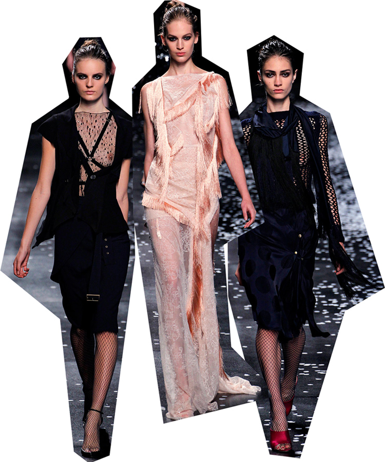
It's a cliche, but 'as sharp as a knife' really does seem to apply to this Lanvin look! Or the sure-to-be-future-cliché, as sharp as Karlie Kloss' hip bone. Who, by the way, would look great in this. Here it fits Julia Nobis so well it looks painted on, and is simply a pleasure to look at.


Well my love for this Altuzarra collection is well documented, but unfortunately one of my favourite looks from it didn't quite fit into my review. The detailing is a bit like the glitter detailing in Spring 2013 Dior. In both cases, this tiny element makes the whole look.


I love to hate Alexander Wang to some degree, and because of that I love it even more when he wins me over in spite of a personal grudge. Although it's funny, the reasons that most other people dislike him - "he ripped of those shoes!" "his ideas aren't new!" - don't bother me. It's comparable to critics of Daft Punk or Kanye West who say they have no ideas of their own, or are even plagiarists, after discovering the extent of their sampling. This kind of sampling and re-purposing is a rare skill in itself, and while you may think that West just stole that 20 second riff, he's actually transformed it, given it a completely different, second life. And that's how I think of Alexander Wang, a very savvy fashion version of Daft Punk. Having said all of that, I dug this ripped-off, unoriginal, whatever, ensemble!


Now that I'm looking at these looks all together, I can see that they're actually all quite similar. Hem length, heels, plunging necklines, monochrome, and general attitude are all aligned (that maverick, the explosion of pink, sits a part a bit more of course).


Runway images from vogue.com
Border detailing from, respectively, Soane Britain; Katie Ridder; Coralie Bickford-Smith; Hokusai and Ari Marcopoulos

28.12.12

Welcome Back, Céline

All the monochrome looks and white at Céline last year was stiff and dull; the large sleeves, wide belts and deconstructed peplum a disavowal of the "clothes-for-real-women" label that had been assigned to Pheobe Philo after her triumphant debut for the label. But by employing the magic of satin, this season all Philo's moves for "real" clothes and sophistication and understated luxury became, once again, a revelation. Céline lost its relevance over the last few seasons but I'm very happy to say that here Philo's shine has returned (sorry, couldn't help myself). I didn't realise it until I caught myself feeling absurdly happy at this showing, but for the past year and a half I'd been holding my breath before each Céline show, only to be completely deflated.


But honestly Pheobe, this season? Congratulations. I'm a real woman and I want to go into a real shop and buy those shiny pants, and buy those shiny tops, and fold my shawls and collars as if I were an impossibly sophisticated antiques dealer who specializes in Chinese folk-art and who has a companion instead of a husband. I want to be the woman that would wear these clothes.


Of course by itself satin isn't really an innovation, and those baggy pants have been around for a while now, yet it's Phoebe's treatment which feels new and relevant; those exact proportions, and that exact size of those twisted shawls, the seeming carelessness with which they've been twisted. And that's true of all creative disciplines isn't it? How new you can make something old feel, with a bit of actual new thrown in.


When a collection is innovative and fresh it also feels clean, as if it has wiped away the built up grime of disappointment and derivatives of past collections. And adding to the sense of cleanliness here was the simple, straight hair and clear faces. Although I think some of the models misinterpreted the instructions to look nonchalant and ended up looking corpse-like. But very fresh-faced corpses of course.


I'm also in that minority that think Ashley Olsen looks sophisticated in Birkenstocks, and in the larger minority that loved Christopher Kane's pool sliders in a totally non-ironic way. So of course, I loved the footwear at Céline!


The footwear also brings up another interesting point, that Philo's "clothes-that-women-really-want-to-wear" tag has its downsides. As soon as I had zoomed up on those fluffy soles and painted toenails I predicted it, every review would comment on whether woman really would want to wear them. It happened, and it was boring. Don't trap designers in the box that you created for them, critics!


all images from vogue.com

14.12.12

We Need To Talk About Dior

Obviously, Dior is a show that needs to be discussed. I've been thinking about it for ages, and I still don't really know what I think about it, not really. Because, like, there were good parts, but then there were also, like, bad parts? It's confusing!

Me, still looking at Dior

But although it got reviews both good and bad, even the good reviews had a tinge of defensiveness about them. Like the reviewers know that there is something wrong with it, or that everyone else overwhelmingly believes there's something wrong with it. Because while there were aspects that I loved, there were some shocking moments too. And I have to admit, when I first saw it, I thought it was lacking one of my key ingredients to a strong collection: cohesiveness.

But let's start with the positives. It was the tiny details which tipped the collection into a success. They unexpectedtly popped up in dress-suits (the new pant-suit) and would have been completely lost on the viewer were it not for stage lights subtly glinting off them. These details, diamante lines and daisy embroidery, ranged from the relatively obvious:


To the very discreet:


Also excellent (I think. Not entirely sure) were the so-wrong-they-are-good mullety tails! Despite the odds, pretty elegant.


On the other hand, I have no idea what Simons was thinking here:


No no, seriously Raf, wtf? You think Kirsten Dunst or Marion Cotillard are gonna wear that on the red carpet? Think again.
So, a collection that doesn't entirely fit together, which sucks in places, yet... thumbs up from me. Maybe it's just that difficult things are more interesting than the easy. I'll be thinking about this for a while, so hats off to Raf for that at least.


all images from vogue.com

5.12.12

Screw Milan, How'd Paris Do?

Reviews of the rest of Milan were supposed to be here. But you know what? Milan sucked overall this season. Everyone did their thing and it looked nice and regular but nothing (apart from Prada) got me thinking or excited. So Imma cruise right through to Paris.

First up, Nina Ricci!
Lots of the reviews for Peter Copping's Nina Ricci were more than just a touch condescending, all along the vein of "awww, Peter Copping twied weally hard to make a tough, Fifty Shades of Grey collection". And sure the "toughness" was kind of adorable, and it wasn't his best, and sure Nina Ricci is more French heiress than whatever Copping was doing here - but regardless, I really dug it. All the folds and ties and zips and fastenings and, yes, harnesses, fell and fluttered in a beautifully haphazard kind of way.


Cardigans and skirts looked like they'd been thrown and tied on backwards, adding to the haphazard (but sexily haphazard of course) effect.


There was a wonderful thread of opposing parts throughout the collection, polka-dots with fishnets, pastel satins with sexy smoky eyes and bared nipples. Once again with Nina Ricci, I feel like we as foreigners have been served the most romantic, fictional version of the aloof/sexy/ultra feminine French woman. And that would make sense, considering Copping isn't French! He's not designing for real French women, he's designing for what the Brits see as a French woman. Which is not rooted in reality but in an inferiority complex and a curious obsession.


And I just wanna say, guys, that I'm really happy that I keep liking Nina Ricci's collections, and it's not just because liking something is nice. I was so sad when Copping replaced Olivier Theyskens back in 2009, he seemed like such a joke after Theysken's achingly poetic collections. As well as hating him on principle, his collections were, admittedly, nowhere near as good as Theysken's.


But now Copping has improved hugely, and is making me change my mind! And he did  it against a pre-existing bias! And while I love making snap judgments, what I love more is having my mind changed, or even being proved wrong.

Yes to this:


And no to this: First collection, Spring 2010, Peter has definitely won most improved player


all images vogue.com

20.11.12

Miuccia Prada, Feminist

Miuccia Prada has done again what she did three years ago for Spring 2010. This show wasn't obviously spectacular, revolutionary or jaw-dropping. Certainly not in comparison to Prada's previous collections. And so people were disappointed. I think many people (regular internet people, not critics) were disappointed with this showing exactly because it wasn't, as Hamish Bowles puts it, "the radical season changer that Miuccia so often serves us". But the problem with holding such high expectations, of always expecting these radical season changers, is that quieter instances of genius are not appreciated. There is the sentiment 'if it's not big, it's not good', and for some this collection was a bit of a let down. But it really shouldn't be!

This collection was, in my opinion, fantastic. Let me list the reasons why:

1. It felt like Prada was getting out some of her feminist energy. It was there in that dichotomy between girlish sweetness and, to paraphrase Prada, a toughness and seriousness. To be precise she said that the collection's folding resulted from her wanting it to be tough, although I have no idea how folding is inherently tough or serious. But let's not get caught up in the details! Importantly I think that what really defines the current wave, or new generation of feminists (that I think can safely be said to be symbolically helmed by Tavi Gevinson) is the co-existence of stereotypical, traditional notions of girlishness (such as dressing up to look good) with feminist ideals. So here I am projecting that Prada has given us the modern feminist - tough, serious, self-possessed, and covered with pink, flowers, and short skirts.


2. In a kind of carry on from my last point, I could imagine Kathleen Hanna rocking everything (and there were total Courtney Love vibes)


3. Jessica Stam.


4. Guinevere van Seenus.


5. That amazing folding, which was also seen at Christopher Kane! Thanks to Hamish Bowles' review I've learnt how this folding also relates to this "new feminist" dichotomy. Prada talked about "the struggles women have between toughness and softness, the rigor followed by delicacy, and the poetic part of women", and this is reflected in the folding of the Japanese kimono, which is about "tough rigor, the delicacy after, and the folding". Hmmm, "tough rigor", maybe that's how folding is tough and serious.


6. Ribbed underwear, and coats in summer. Nothing more to add.


So overall, I felt the Prada spirit very strongly here, with all those wonderful tensions between femininity and feminism, and all those wonderfully uncomfortable details (like ribbed underwear). Everyone came around to Spring 2010 eventually (myself included), and the same slow-building appreciation may happen here again.


all images from vogue.com

15.10.12

Altuzarra

This post was going to be about Marc Jacobs, how it was one of my favorites of New York, but in the time it's taken me to get around to it I have completely gone off it. Perhaps it's because I saw the Louis Vuitton show, hated it, and then realised how similar it was to MJ. And at first I could look past the whole Edie Sedgwick thing, but OH GOD HOW I HATE HER and I just can't do it anymore.

So instead I'm gonna talk about Joseph Altuzarra! If you consider a collection as a single statement, yet made up of multiple parts - kind of like a music album or an artists' series - then here Altuzarra created a damned near-perfect collection. There was serious growth. There were also variations on a theme. But then if you placed the earlier looks with the later, the connection is not obvious at all. Yet overall, the whole collection fit perfectly together and was cohesive. I've said it before and I'll say it again, cohesion is what makes a good collection - and then cohesion made up of divergent parts is what makes a collection great.


I really dug the Carhartt-esque jackets with little Altuzarra logos, as well as the printed jean(?) skirts and blue shirts. It seems, to borrow a phrase, just so fresh and so clean. Clothes that I want to wear as well as simply admire and write about. Because let's be honest, I go nuts about Alexander McQueen but I will never want to wear it.


And then things get SERIOUS with the draping and the wrapping and the folding and all the beautiful detailing (that little panel on the green dress makes the outfit). One review said it headed into couture territory and I'd agree. And the blue-white combination of the earlier looks are repeated here, but changed to a darker, more intense blue and cream instead of white. Ugh I just LOVE subtle themes that run through collections.


The last looks tossed out practicality altogether, but I really hope that we see at least some rich socialites wearing these in the social pages and in the Sartorialist or whatever. They are too beautiful not to be worn, especially in moody, evening lighting where the gold tassles get highlighted and sparkle. I'd also like to say that the generally "ethnic" vibes are ok because Altuzarra is not directly referencing or copying any particular traditional dress. But there are always some who'd disagree on that.


That "ethnic" wrapping and draping had parallels with an unusually good Marc by Marc Jacobs collection. It doesn't make up for other disappointments, but it was a nice surprise.


all images from vogue.com

5.10.12

Krakoff Re-Inspection

The next coupla posts are my favourite New York shows this season. I'd like to think that a few weeks is enough time for me to have some kind of perspective on the whole thing - for instance, I was really underwhelmed with Prada initially, but BOOM a week later I decided it's great. Similarly, with Reek Krakoff I looked over it pretty quickly and wondered why you'd base you're entire palette on beige, and then dismissed it. But then yesterday I was trying to find this model that looks like someone I know, and I came across this photo. And then it clicked! I got it! This wasn't just beige. Krakoff was using colour and texture subtly, employing them to create these complex architectural shapes, which is usually reserved to cut.


Once I'd decided that the collection was really quite smart and nuanced after all, I checked out the Vogue.com review because those guys can be pretty insightful. But ugh it was the worst thing ever, Emily Holt just went on about how the bags were convenient because you don't have to waste time folding them over or something. Wut? I don't care about bags lady!


Some of the pieces look like they've been put together really complicatedly, and that there's lots of layering going on, like in the middle piece below. But I think they're just single items that you throw on. Insta-depth.


Man these mixes of colour - beige, cream, brown, black - and textures - chiffon, cotton, leather, satin - make for some seriously compelling looks. This collection is really worth second or third viewing. The more I look at these clothes the more I see. You know I don't think, deep down, that many people pay that much attention to ol' Reed. His reviewers tend to focus on his collections commercially, the clothes evaluated on their potential to be worn. Case in point: Nicole Phelps who said that for the dresses "the sheer overlays proved more distracting than they were flattering" - it's not always about being flattering! Critics think he's just another guy dabbling in minimalist luxury, and how much can you really expect from a guy whose background is bags right? Wrong! Krakoff's more than he seems guys! He's clever and subtle! Why can't you see?


all images vogue.com

27.9.12

Rochas Makes Me Wanna Wear Satin

Nothing articulate to say on this, just "wooooooooooooooooooo satin!" "cool!". That's what I was thinking when I saw these looks anyway. Didn't really like the rest of Rochas, I don't really like Rochas in general, to me it's just kinda precious and annoyingly hip at the same time. But damn that satin.


images from vogue.com

14.9.12

Rodarte's Back to Kicking Ass

Thank the lord! Rodarte's gone back to being fun and fantastical again! Fantasy role playing, what an awesome - not cool, awesome - starting point. And they did it right too. I'm actually really glad that they've tackled medieval fantasy, because in illustrations and comics and movies the costumes are always awesome, but anyone who has been to pop culture conventions knows that IRL attempts to dress fantasy fall way, way short. Now the average convention goer can just pop into their local Rodarte store! Right.
Now I'm kind of waiting for this pink ensemble to show up in Final Fantasy.


But then there were definite sci fi vibes - I can see Daryl Hannah running around 2019 L.A. in those leather pants - so I guess the Mulleavy's decided to deal with nerdiness in one fell swoop. And they really picked up on what is so great about role playing and fantasy and sci fi! Laura said it was about "being who you imagine your best self could be". I have a confession to make guys, that is almost exactly like my personal motivating motto. When I'm having a down day, feelin' bad, feelin' sad, I tell myself that I am the best version of myself I could possibly be. And then I usually just feel awesome, like a "you go girl!" to yourself. You should try it sometime.


When the collection gets really medieval the baddassery levels are high. Lara Mullen and Katlin Aas always appear a bit formidable but in these threads they look like they can talk the talk too - as in they could wield a sword and/or magic while also looking grumpy.


In the flippy skirts you could see a bit of last season Proenza Schouler which means you could see a lot Balenciaga in general (there was even the familiar pumpkin colour cropping up), but I'm not saying that's a bad thing. They've treated those influences in their own way, and Balenciaga is pretty synonymous with sci fi these days. Maybe the Mulleavy's felt obliged to reference them! And back to those flippy skirts, they may be very Proenza Schouler, but can't you imagine how perfect they'd look, flipping about while riding and/or slaying dragons?


P.S. Skrillex hair is hilarious but I am also totally digging it at the same time.


all images from vogue.com