28.2.13

Don't Forget the Details

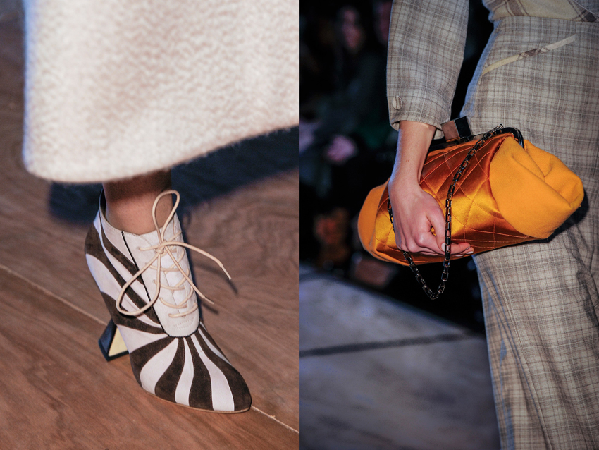
Only ever seeing collections from a computer screen means you can forget about the finer points that makes clothes what they are. Things like movement and the fact that they exist in three-dimensions rather than the two that LED lit pixels afford us. What was it that Grace Coddington said? "On a flat screen, things look flat". The closest us regular folk can get to the real thing are the videos. But in both video and still image, you can still forget about the details. And in cases like the latest, personally disappointing Rodarte show, the clothes actually look better close up than from afar. If I hadn't stumbled across these over at the Self Service website I would not have known the subtler beauty of the collection that consisted of textural contrasts between silk and cotton, tonal contrasts between black and navy, and tiny barbed wire fastenings.


Prompted by Rodarte I've been making a point to look through all the detail shots of every collection, especially ones I'm on the fence for. Unfortunately the lighting at Roksanda Ilincic was bad, or the photographer seems to have used a far too powerful flash, because in the regular runway images the clothes are super washed out.  But hurrah for the detail shots, because here the true hues shine through, as does the luscious detailing.


images from Self Service and Vogue.com

19.2.13

Valentino Kerchiefs

I'm starting to tire of the new Valentino aesthetic just a little, but I loved these skirt edges which are like folded handkerchiefs.


They remind me of the folds at Balenciaga, which are almost verging on ruffle territory, and which we are all sobbing over *RIPNIC4B*


images from vogue.com

12.2.13

Bouchra and Couture

I really don't understand why Bouchra Jarrar is still doing couture. It's generally acknowledged her collections were never really true couture to begin with, but more a formidably, rigorously tailored ready-to-wear. However, I appreciated her debut in couture as a clever marketing and brand development move. With the less cluttered couture calendar there was more space for her to get noticed, and it made a clear point about the "seriousness" of her label, her skill level, and the kind of clients she wants to attract.

But to be honest, once she debuted at ready-to-wear, I thought she'd give up the ghost at couture. I thought she'd achieved what she needed from showing there, and could focus on the elegant day-wear that she does so spectacularly well. Well, she hasn't given up, here she is, still at Couture.


Having said that I thought that this collection was good. She's riffed on the asymmetrical trend, but because she's Bouchra Jarrar the coats and jackets are far more impeccably tailored than any other effort. I love me any stripes that you can't describe as nautical or French, and this collection was full of 'em. Not a boat neck or ballet fit in sight. And the restrained palate of brown, navy and black was perfectly balanced. The navy was on the almost-blue end of the spectrum and offset the brown  wonderfully.


One thing I can say in support of Jarrar remaining on the couture calendar, is that it keeps up the important discussion about the definition of couture, and what it needs to be in the 21st Century. The arrival of Raf Simons at Dior is of course helping fuel the discussion too, and each season I become more excited to see in what direction couture is now growing.


all images from vogue.com

23.1.13

Shelley Jacobson

Shelley Jacobson is a New Zealand artist whose photographic works are about environments, both urban and natural, altered and untouched. A lot of the photographs have the same effect on me as standing above a great height, they are overwhelming and I have this urge to jump. Obviously I can't jump into a photograph, but with their big empty spaces these photos are still almost physically compelling. As for those great heights, needless to say I'm afraid of them.


In New Zealand Jacobson travels to areas that have been altered by humans, such as mines and quarries, and documents these wounds on, and healing of, natural landscapes.


Jacobson's work in Japan focuses on the intimate urban landscape. Here the man-made landscape is framed by its natural environment, or in my favourite photograph, (wo)man frames the natural.  In the portrait of the tree you can see a little golden plaque on its trunk. That is there to explain that the tree was damaged by, yet survived, one of the atomic bombs. Apparently there are these trees in various locations in Japan all with their own plaques. I guess they are symbols of hope and resilience, and in the context of Jacobson's work it is symbolic on a dual level; for both nature and humans.


The theme of destruction follows through to even completely natural landscapes. The Sea of Trees series documents, in Jacobson's words, "the Japanese suicide landmark Aokigahara-jukai" and its "socially constructed spatial boundary". So even in the natural the human leaves an horrific mark, albeit not a physical one.


While this knowledge about the meaning and intent behind the work can enrich the viewing experience, the first encounter with these photographs is incredibly evocative without any context. It's almost a shame that I explained to you their meaning first. Free of any figures, Jacobson's photos have that same still, peaceful quality that I've talked about before with interiors photography. But instead of this absence creating an absence of meaning, more possibilities are actually created for the viewer. In the absolute stillness of these images I can hear myself crunching through the snow and foliage of the trees, or the echo of a stone being thrown into the goldmine.

Jacobson has called her approach at times "consciously mundane and systematic", but far from this resulting in sterile images, they are curiously compelling and personal.


all images from Shelley Jacobson's website

15.1.13

Skirt over Pants

Givenchy tried it. Did it work? Not really. Except, remarkably, here, in this one look. Maybe one day I will be able to figure out the mystery of such things. I bet Tim Blanks already has.


As an aside, you may notice that the range of locations (within New York) that Givenchy is using for their Pre-Fall shoots has reduced dramatically. I like to think that the team of assistants have simply refused to lug all the equipment around anymore.


image from vogue.com

12.1.13

Stragglers

How has pre-fall rolled around so quickly? Sorry, not just rolled around, but already almost over? I'm still working through Spring/Summer! I really do think we need to de-clutter the fashion schedule, if only so I have enough time to make my mind up about things. And so, as a final adieu to posts on Spring/Summer 2013, these are those last scraggly looks, those wonderful looks that come from collections that, as a whole, I did not deem worth writing about. Or that didn't quite fit into the reviews I wrote at the time.

First here are two looks from Chloé, which I usually yawn at, but the genius of an eruption of baby pink chiffon in the direction of your face cannot be denied. In fact, since this look specifically was dissed by a few critics, my fervor for it has grown.


I want to wear these stripes, but I also want them on my couch and on my curtains and on my sheets and everywhere. 


It's a cliche, but 'as sharp as a knife' really does seem to apply to this Lanvin look! Or the sure-to-be-future-cliché, as sharp as Karlie Kloss' hip bone. Who, by the way, would look great in this. Here it fits Julia Nobis so well it looks painted on, and is simply a pleasure to look at.


Well my love for this Altuzarra collection is well documented, but unfortunately one of my favourite looks from it didn't quite fit into my review. The detailing is a bit like the glitter detailing in Spring 2013 Dior. In both cases, this tiny element makes the whole look.


I love to hate Alexander Wang to some degree, and because of that I love it even more when he wins me over in spite of a personal grudge. Although it's funny, the reasons that most other people dislike him - "he ripped of those shoes!" "his ideas aren't new!" - don't bother me. It's comparable to critics of Daft Punk or Kanye West who say they have no ideas of their own, or are even plagiarists, after discovering the extent of their sampling. This kind of sampling and re-purposing is a rare skill in itself, and while you may think that West just stole that 20 second riff, he's actually transformed it, given it a completely different, second life. And that's how I think of Alexander Wang, a very savvy fashion version of Daft Punk. Having said all of that, I dug this ripped-off, unoriginal, whatever, ensemble!


Now that I'm looking at these looks all together, I can see that they're actually all quite similar. Hem length, heels, plunging necklines, monochrome, and general attitude are all aligned (that maverick, the explosion of pink, sits a part a bit more of course).


Runway images from vogue.com
Border detailing from, respectively, Soane Britain; Katie Ridder; Coralie Bickford-Smith; Hokusai and Ari Marcopoulos

10.1.13

A Whole New World

I tell ya, I get all Aladdin every time I read a new issue of World of Interiors. There is this whole universe of interior design and decorating and furniture and textiles that I never knew existed, and dipping your toes into it is terrifying. Googling "Louis XVI furniture"? "Moroccan tiles"? Whoa, don't do it man unless you want your mind to be blown. I guess it's like walking into a record shop and saying "I'm getting into classical music - what can you recommend?"

But I can take baby steps. One step was appreciating this beautiful editorial (editorial? I don't know the lingo when it comes to interiors rather than fashion) from the November 2012 issue on contemporary printed fabrics. 


It's far easier googling the name of individual designers, and I've found a couple of favourite textile designers. Sure they don't have much competition for my "favourite" status yet, but I'm sure they'd still stack up once my knowledge expands.

Katie Ridder is routinely described as being "whimsical", but I hate that adjective so I'll say elegantly graphic with a keen and restrained sense of colour. The "attendants" print (below, top left), which can be see in one of the sacks above, is my favourite.


Soane Britain doesn't portray figures or objects in the same way as Ridder, rather they use mesmerizing  deceptively simple, and wholly encompassing patterns, employing once again colours that I just want to eat. That pinky-red is like the jam from sponge cakes, that orange like the juiciest mandarin.


But it must be said I'm already regretting becoming interested in interiors. I thought my relationship with fashion was expensive - but it couldn't prepare me for £150 - £276 for a metre of any of this fabric. I'll have to resign myself to gazing at their representations on the computer screen.


images from respective designers' websites & World of Interiors magazine