5.10.12

Krakoff Re-Inspection

The next coupla posts are my favourite New York shows this season. I'd like to think that a few weeks is enough time for me to have some kind of perspective on the whole thing - for instance, I was really underwhelmed with Prada initially, but BOOM a week later I decided it's great. Similarly, with Reek Krakoff I looked over it pretty quickly and wondered why you'd base you're entire palette on beige, and then dismissed it. But then yesterday I was trying to find this model that looks like someone I know, and I came across this photo. And then it clicked! I got it! This wasn't just beige. Krakoff was using colour and texture subtly, employing them to create these complex architectural shapes, which is usually reserved to cut.


Once I'd decided that the collection was really quite smart and nuanced after all, I checked out the Vogue.com review because those guys can be pretty insightful. But ugh it was the worst thing ever, Emily Holt just went on about how the bags were convenient because you don't have to waste time folding them over or something. Wut? I don't care about bags lady!


Some of the pieces look like they've been put together really complicatedly, and that there's lots of layering going on, like in the middle piece below. But I think they're just single items that you throw on. Insta-depth.


Man these mixes of colour - beige, cream, brown, black - and textures - chiffon, cotton, leather, satin - make for some seriously compelling looks. This collection is really worth second or third viewing. The more I look at these clothes the more I see. You know I don't think, deep down, that many people pay that much attention to ol' Reed. His reviewers tend to focus on his collections commercially, the clothes evaluated on their potential to be worn. Case in point: Nicole Phelps who said that for the dresses "the sheer overlays proved more distracting than they were flattering" - it's not always about being flattering! Critics think he's just another guy dabbling in minimalist luxury, and how much can you really expect from a guy whose background is bags right? Wrong! Krakoff's more than he seems guys! He's clever and subtle! Why can't you see?


all images vogue.com

27.9.12

Rochas Makes Me Wanna Wear Satin

Nothing articulate to say on this, just "wooooooooooooooooooo satin!" "cool!". That's what I was thinking when I saw these looks anyway. Didn't really like the rest of Rochas, I don't really like Rochas in general, to me it's just kinda precious and annoyingly hip at the same time. But damn that satin.


images from vogue.com

25.9.12

Slashing with Rodriguez and Saunders

I really love how the stars have aligned for Narciso Rodriguez lately. His 90s minimalist look is coming back in vogue, and he's also simultaneously churning out his best collections in a long while. Maybe it's this very focus back on simplicity that's reinvigorating him.


For Spring 2013 the collection's best looks were these billowing chiffon dresses with the geometric layering print. And then the same kind of thing popped up in Jonathan Saunders for one of his best collections yet! It still amazes me how this synchronicity happens with different designers, on completely different continents. Yet it happens season after season! I mean, Jonathan Saunders even had massive graphic stripes like the ones at Marc Jacobs.


It's neat how Saunders is influenced by this 90s minimalism, so he also throws in some other 90s stuff like high halter necks. It's cute or something. But I dunno about the Tim Burton Willy Wonka sunglasses, although the blow-up doll lipstick was kinda cool in a perverse way.


all images from vogue.com

14.9.12

Rodarte's Back to Kicking Ass

Thank the lord! Rodarte's gone back to being fun and fantastical again! Fantasy role playing, what an awesome - not cool, awesome - starting point. And they did it right too. I'm actually really glad that they've tackled medieval fantasy, because in illustrations and comics and movies the costumes are always awesome, but anyone who has been to pop culture conventions knows that IRL attempts to dress fantasy fall way, way short. Now the average convention goer can just pop into their local Rodarte store! Right.
Now I'm kind of waiting for this pink ensemble to show up in Final Fantasy.


But then there were definite sci fi vibes - I can see Daryl Hannah running around 2019 L.A. in those leather pants - so I guess the Mulleavy's decided to deal with nerdiness in one fell swoop. And they really picked up on what is so great about role playing and fantasy and sci fi! Laura said it was about "being who you imagine your best self could be". I have a confession to make guys, that is almost exactly like my personal motivating motto. When I'm having a down day, feelin' bad, feelin' sad, I tell myself that I am the best version of myself I could possibly be. And then I usually just feel awesome, like a "you go girl!" to yourself. You should try it sometime.


When the collection gets really medieval the baddassery levels are high. Lara Mullen and Katlin Aas always appear a bit formidable but in these threads they look like they can talk the talk too - as in they could wield a sword and/or magic while also looking grumpy.


In the flippy skirts you could see a bit of last season Proenza Schouler which means you could see a lot Balenciaga in general (there was even the familiar pumpkin colour cropping up), but I'm not saying that's a bad thing. They've treated those influences in their own way, and Balenciaga is pretty synonymous with sci fi these days. Maybe the Mulleavy's felt obliged to reference them! And back to those flippy skirts, they may be very Proenza Schouler, but can't you imagine how perfect they'd look, flipping about while riding and/or slaying dragons?


P.S. Skrillex hair is hilarious but I am also totally digging it at the same time.


all images from vogue.com

3.9.12

Let My Cameron Go

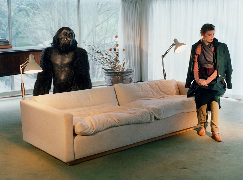
This pop editorial is called "Bad Moon Rising" but I'm getting more Ferris Bueller vibes. Could this actually be Cameron's house? It was on the market a few months ago. These are just some musings which really add to the viewing experience of Valerija Kelava and a gorilla getting domestic. Ooooh and listen to this if you really want to enhance your viewing.


I can't help myself.


29.8.12

Empty Rooms

Deep post title right? But in this case it is literal. I've been browsing the personal websites of production designers/art directors and the photos on the sites are great. These photographs make what seemed like 'real life' on the film screen look like a stage set. In some part this is due to the lack of people, but the way these rooms are photographed is just kind of weird. They don't look like interior design or architectural photos, they don't look like family snapshots, they are something else. What? I don't know! I just like 'em!


So this first bunch and the next three are all from Carl Sprague for The Royal Tenebaums. He's got a background in film sets which works really well with Wes Anderson. You should definitely check out his website it's got all these great sketches from his projects, and more photos like these (plus Anderson with short hair!)


Good design can make a mediocre film watchable. I didn't like Synecdoche, New York all that much, and yet I could watch it three times. I was initially perplexed, then I realised - IT JUST LOOKS PRETTY. Well not pretty but aesthetically pleasing, and it has this excellent cohesiveness, like a darker blue, mouldy green alternate universe where everything relates to each other. So thank you Mark Friedberg for making an overblown, pretentious film worth watching three times.


And let us not forget exteriors and non-domestic interiors! Wes Anderson's movies don't just co-ordinate everything inside, but outside too!


images from Carl Sprague and Mark Friedberg's websites

25.8.12

Pari Dukovic - Art and Fashion #6

I have a handful of blogs that I read daily, and The New York Times' The Cut would have to be my favourite. I knew that they would be unveiling a new overhaul soon, but I was happily surprised to discover that the day has arrived! And if the first feature is anything to go by, this incarnation will a be a roaring success.


To kick off the new feature - a super-large-format, high-resolution image slideshow -  is a series of 63 photographs from Pari Dukovic, taken over the F/W 2012 fashion month. I am totally amped about Pari Dukovic at the moment. He seemed to come out of nowhere the season before with some seriously unusual and seriously compelling show photography. The big fashion photographers of course work in editorial - but this Pari, he's turning shows into an art worthy subject.


Part of what makes the photos so wonderful, and so different, is their texture. I don't know what camera he uses but at times the photos are so grainy they look sketched. How refreshing is it to be reminded of the materiality of a photograph! Ironic, I know, since I'm seeing these on a computer screen, but you can just imagine their physical glory.


For those of us who, like me, only experience these events through pictures, Dukovic's photographs create a world even more fantastical and evocative than before. Who would want to attend the reality of a show when you can attend Dukovic's more sublime vision of reality!


all images by Pari Dukovic (duh) from The Cut